As always, one idea leads to another. I am planning warp colors for linen lace weave scarves, and color wrapping helps unleash ideas. And your comments helped “stir the pot.” You asked for my thought process. Here goes. (If you missed Tools Day: Color Wrapping, you’ll want to read it first.)
I started with the idea of making a smooth transition from one color to the next. That was card #1. Then, I made more distinct stripes on card #2. For #3, I aimed for a mirrored arrangement. #4 blends colors in a different order.
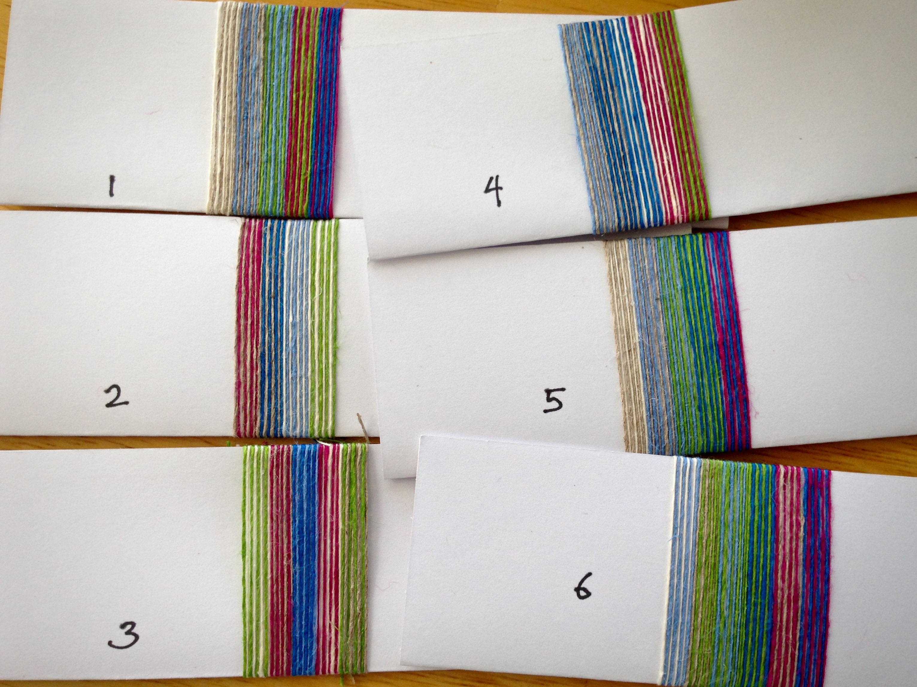
Of those first four cards, #1 was close to my ideal. But the magenta and green stripe seemed out of sync. So I made adjustments, and card #5 became my favorite.
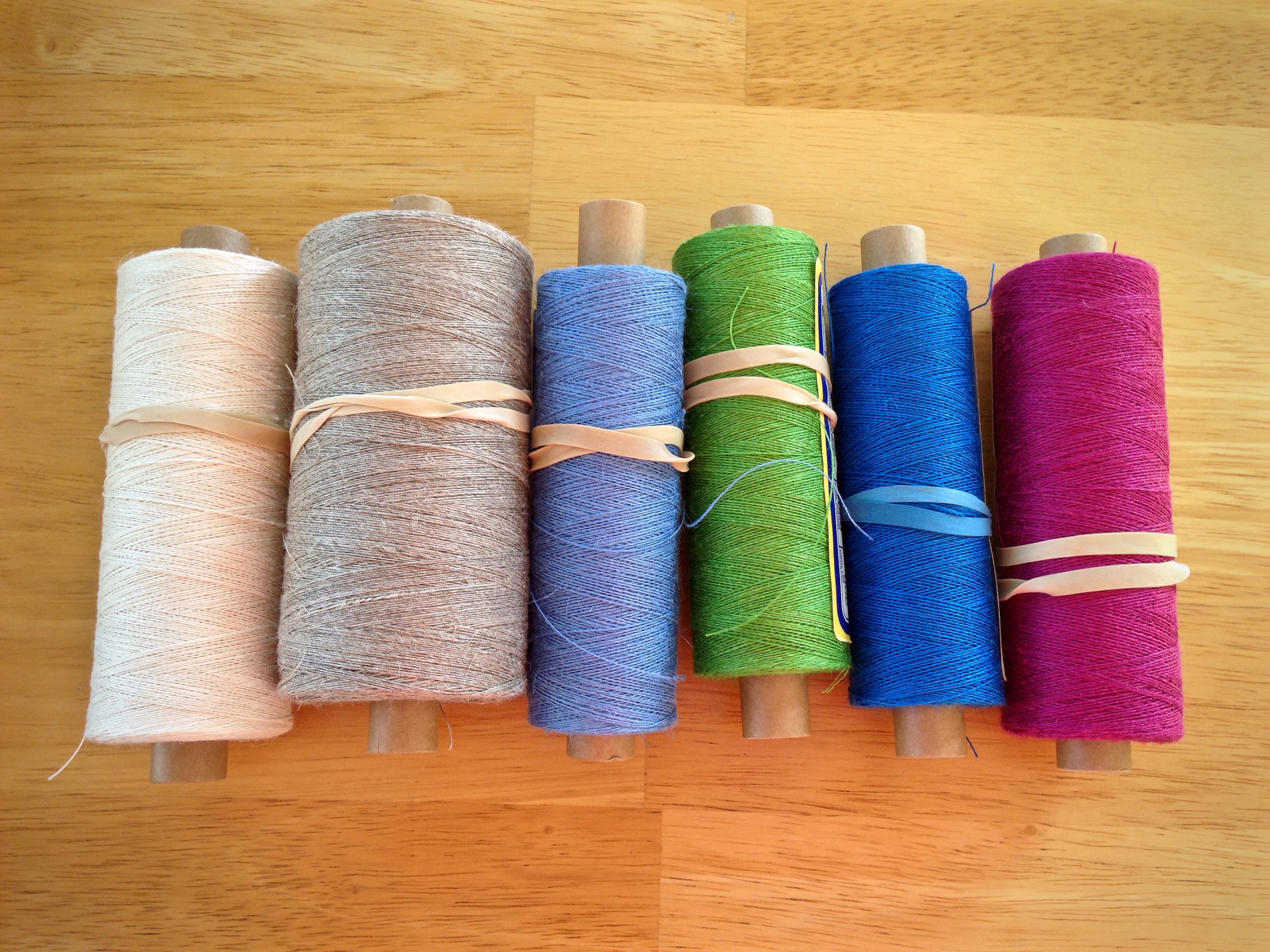
Next, I arranged the six colors of thread from light to dark, and paired each color with its best partner. For example, starting with cream, “With which other color does cream look best?” With enough samples to see all the options, I concluded that light blue suits cream the best. I did that kind of pairing with each color to make card #6. Now #6 became my runaway favorite! And, card #6 received the most votes in the comments from you, too.
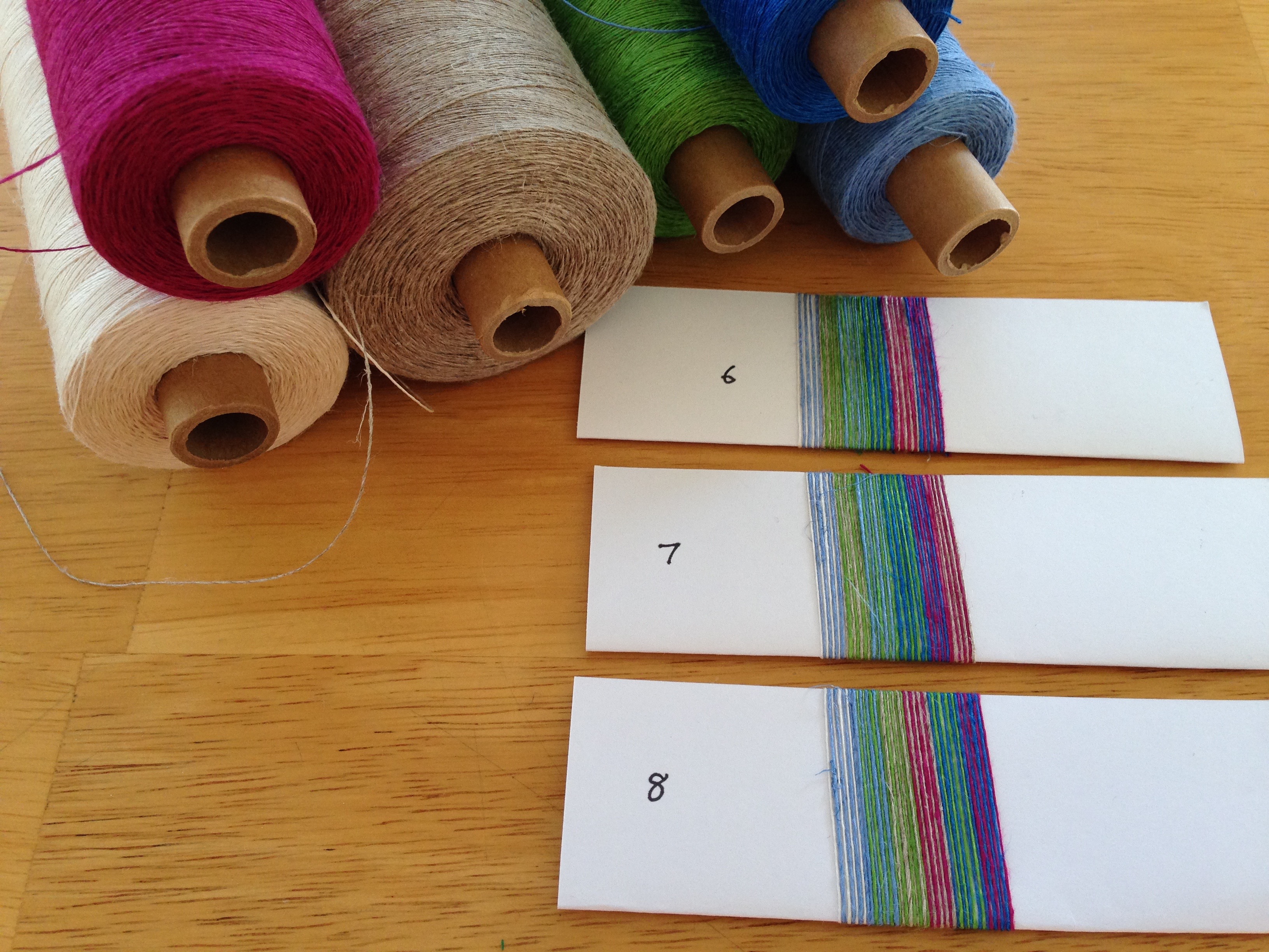
I color wrapped two more cards, trying to improve the color gradation. #7 and #8 have the same composition of stripes as #6, but in different arrangements. The “winning” color arrangement will become stripes spread across the warp in a Fibonacci sequence.
Now… Which one of these three would you choose: #6, #7, or #8? (I’d love to hear from you if you left your opinion the first time, and if you didn’t.)
May you see options by thinking things through.
Happy Coloring,
Karen
6 or 8 6 blends more but 8 will give a little bit of omph be interested to see what you go with will be watching with intrest
I really like #8. It has a pop to it that #7 is missing. I will be interested in see which one gets the most votes.
Karen
I’m having a great time with this. I made the picture full screen and stood across the room to look at it and also looked at it after making it black and white. My conclusion is that I love the pop of red in the middle of #8. Which, by the way is totally lost in black and white. Are you going to repeat the stripe sequence more than once? I know you were going for a gradation of color, which you’ve achieved beautifully, but I prefer an overall balance. For instance if you did light dark light by doing a mirror image on the other side. All this, IMO.
Betsy,
I have considered repeating the stripe sequence in a mirrored arrangement, but I think I’m leaning toward asymmetry this time. btw, I used black and white to help in re-arranging the stripes.
Thanks for your thoughtful input!
Karen
Cause you like opinions, I am saying that. personally, and only because Of the delicate lace pattern you chose, I would have been conservative, gone back to #5, and blended the edges of the warp stripes gradually. Iwould have thought that the warp should take a back seat to the lace structure, The red I am not crazy about in that selection. But go ahead with any choice, and see what happens………the unexpected can turn out the most glorious!
Frances, I love opinions! Thanks for including yours. I actually agree with you, to a point. I’m still debating with myself about #5 and these three finalists. I think I see a way of getting the best of both. I, too, am not crazy about the magenta (it looks red). It’s just not behaving for me.
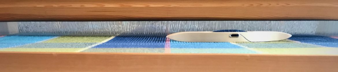
Normally, I would do lace in white or off-white, which certainly helps show off the lace. I’m in the mood to try something out of the ordinary, and see what happens. It could be fabulous or it could be a flop… we will see.
Thanks for the feedback!
Karen
I moved my chair away from the computer and looked carefully at the colors.
You have a yellow/green in the mix. Be careful of this color. Yellow/green can
be dangerous. It is very hot compared to the cool relationship of the other colors. Mixing the yellow/green with blue or lavender is a nice way to go.
But, by itself it is visually jarring. Unless you are using a color range on the warm side of the color wheel, my rule of thumb is even one thread of a yellow/green can attract you eye. Yellow is HOT. Think sun. Yes, yellow and blue make green which can be a nicer color depending on how much yellow is in the mix. With a lace weave, my eyes would want to be more involved in the beauty of the structure as the warp and weft floats make the design.
Again, suggest that you draw the structure as an interlacement to see where the colors will pop in the warp floats and how will these floats relate to the weft. It can be very challenging to make a strip warp for a lace interlacement.
If you have computer software, use it to play with interlacement and color.
If you don’t, it is not that difficult to draw the interlacement a few time and then copy it in multiples and apply color pencils.
Look at the size of the strip and the size of the lace interlacement. The warp floats can either make or break the visual design. Yes, there will be color mixing. The length of the warp float (especially if it is white or natural will play a strong roll in the compensation…. Just a few thoughts. Now time to wind a warp…
Marie, thanks for the great advice! I hadn’t noticed the yellow, but you’re right that the green does appear as yellow/green in this mix. I will take that into consideration as I determine the width of the stripes.
I do have weaving software, but I get frustrated with it, and I usually end up drawing it out on graph paper.
In some ways, I feel like breaking the rules with this project…just for the fun of it. We’ll see.
I really appreciate your input!
Karen
What’s the weft? That may change the whole thing??? LPJ, linda
I think 8 – the lace structure may change the colour interaction but I think it’s worth a sample. I’m amazed at how different 6,7 and 8 are with only minimal colour changes!
Dorinda, yes, it surprised me, too, to see the difference it made to just swap a few things around!
a lot depends on your choice of weft. and if you’re going to repeat these stripes in an organized fashion. my first reaction is that i still like #6 best. but if it were mine… . . i’d use #8 and put the red on either or both sides. i tend to prefer non- predictible when it comes to strips.
can’t wait to see what you finally decide on.
Maggie, Now, that’s a very interesting suggestion – to put the red on either or both sides for #8! I may need to wrap another card to see what that looks like.
Thanks so much!
Karen
because the samples are on such a stark white background my perception may be skewed. I think my brain wants to include the white in the mix. I found covering the white with my hands may help me get a new feel. I’m sure it will be beautiful when your done. go with your gut. our opinions are ok, but it’s your project. That AAH HA moment will come. LP&J, linda
Linda, I did the same thing, but it was easier for me, because I could just cover up the ends of the cards.
I appreciate your encouragement so much!
Karen