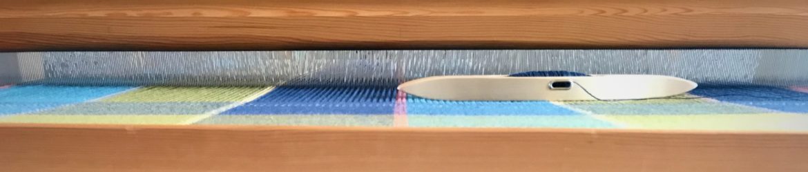
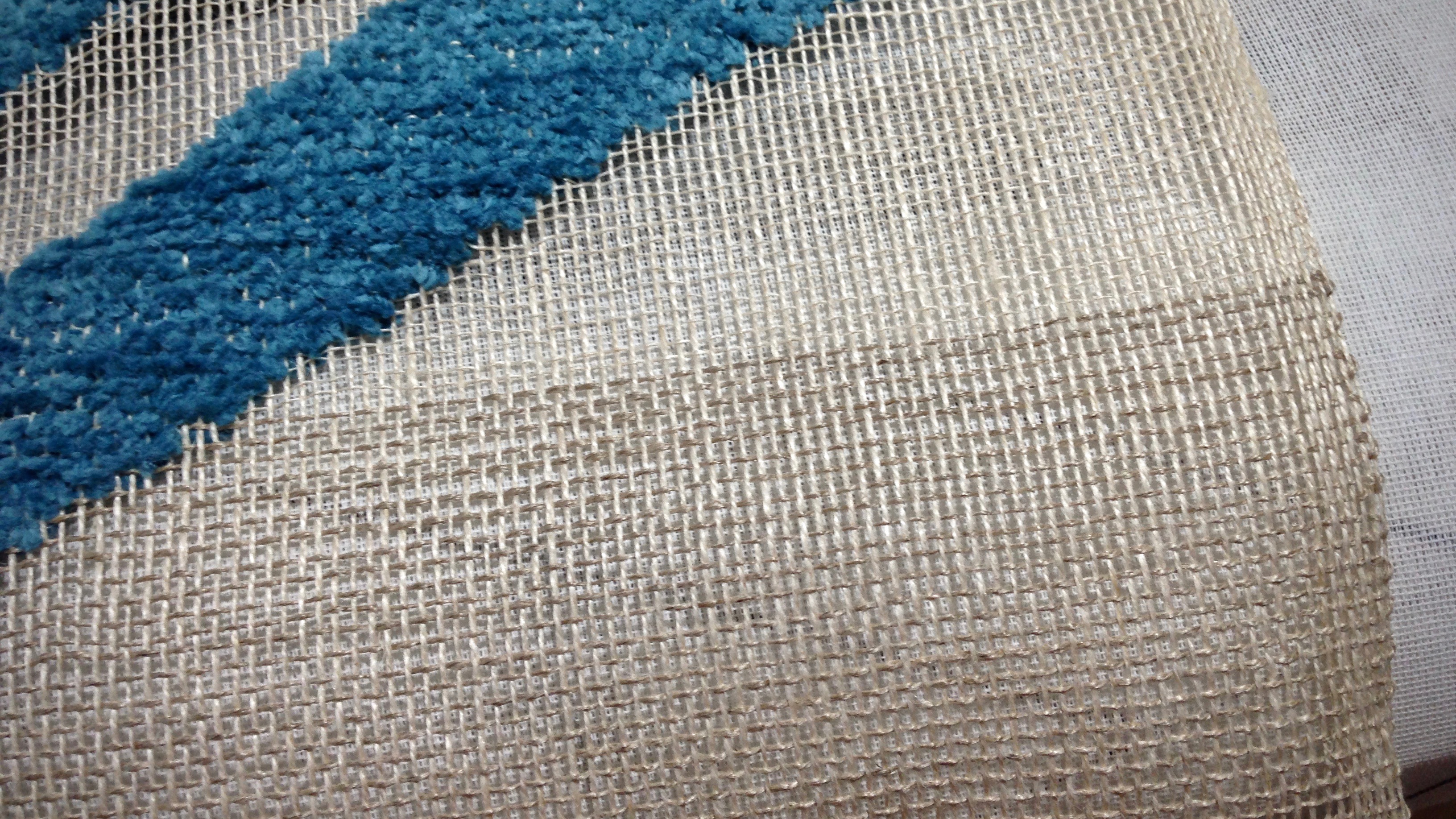
The cotton chenille looks as if it is magically suspended in space. But it’s the linen that suspends it. 16/2 unbleached linen weft crosses 16/2 golden bleached linen warp. The two shades blend into one as they are woven for the transparency background.
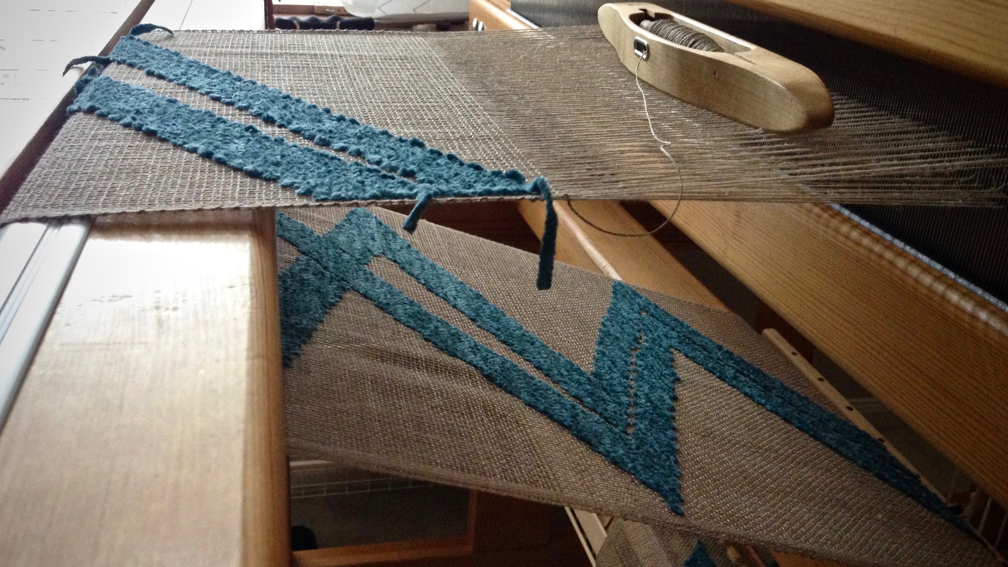
Unfortunately, I had 16/1 golden bleached linen (16/1 is half as thin as 16/2) on my winding table, for the plattväv towels on the other loom. I wound a quill with the 16/1 and wove the transparency with it. It’s the wrong thread size and color. For 8 1/2 inches! Too far to undo without irreparably damaging the linen warp. This is disappointing. How did I let that happen? Take a deep breath… Move forward, and finish out the weaving with the correct 16/2 linen.

We all fall short. We do the wrong thing. That’s a weight to carry. Jesus breaks the yoke of our burden, and lifts the weight. We have been set free! When we finish the weaving, the chenille pattern will be the main attraction, not the error. By amazing grace, the error is overcome by the light shining through the transparency.
May your burdens be lifted.
With you,
Karen
What about embroidering a word like “love” or a symbol representing love on the darker weft? And use the teal color to reflect the pattern that is winding through the entire weave…like love is present in our lives. A simple handwritten word to contrast the strong and bold zigzag 🙂
Elisabeth, I like that idea. I think that would look great!
Thanks,
Karen
And what about weaving in (rows of running stitches) a very fine gold thread into the darker section to give it a slight shimmer and emphasize the importance of it? And then place something important to you in this section…or maybe just the gold is as subtle as it should be…
Love,
Elisabeth
I can picture the subtle shimmer… Elegant!
Lovely, Karen! 16/1 is often used as weft with 16/2 as warp in transparency weaving. It makes the transparency more lacy.
Hi D’Anne, That’s good to know that 16/1 is a good weft for this. I can see how the thinner thread makes it lighter in appearance. Maybe I should start with that next time, and use it all the way through.
Thanks for letting me know!
Karen
Karen the weft mistake was not a mistake it was a design element! Love the transparency.
Hi Martha, Yes, it is a design element now. No one will ever know…
I’m glad you like it!
Karen
Hi, Karen, Your Blog is always inspiring.There are no mistakes, only designer enhancements. . . perfection-in-imperfection. I am told that the Navajo weavers intentionally weave a mistake into each rug.When we are weak HE is strong.
From Pastor David Anderson -Finding Your Soul – “The Navajo say that is ‘“where the Spirit moves in and out of the rug.”’ God’s Spirit moves in and out of imperfection. . . a ‘“mistake?”’ We’ve spent our whole life trying to get rid of all imperfection. If we’re not there yet, surely God is! We may not have the spiritual courage to weave those mistakes deliberately, but at least we can accept them as a gift when the fabric of our lives is inevitably torn.”
Hi Pam, a designer enhancement sounds a lot better than mistake. Thanks for sharing this interesting perspective.
Karen
Hi Karen
I’m told the Amish also make a “mistake” in every quilt so as not to boast since perfection only belongs to a God. Good for you for making the best of what you had not planned.
I got out of the habit of reading your blog for a while. I’m glad now for the reminder of what I’ve been missing. Your writings are beautiful and you are blessed with a wonderful mind and soul. Im sure you’ll never know how much you inspire people…..creatively and spiritually.
Bless you,
Teresa
Hi Teresa, Our mistakes do help keep us humble. That’s interesting that the Amish do that intentionally. Your kind words mean so much to me!
Thank you,
Karen
I would love to try something like this for a glass door panel. Do you have a reference for learning this technique? Looks like you sett the edges closer together and in a different post the casing as well. Would you recommend the 16/1 or 16/2 based on your design element?
Thanks
Cheryl
Hi Cheryl, This would be perfect for a glass door panel.
Resources I recommend: Sheer Delight – Handwoven Transparencies, by Doramay Keasbey; The Big Book of Weaving, by Laila Lundell, pgs. 162-163; 166-167
The Keasbey book is full of wonderful ideas and shows work of different artists, and has some good tips and procedures. The Lundell book has 2 transparency projects, and is a good place to get your feet wet with the technique.
The selvedges for my transparency: 1 (heddle) – 2 (reed), 4 times each side. This is from The Big Book of Weaving. The other transparency in the book has 2 – 2, 3 times each side.
I wanted to differentiate the start and end of the casing, to make is easier to sew, so I packed the weft in tighter in those areas.
The warp is 16/2 linen, and I do prefer the 16/2 linen for background weft over the 16/1 that I used by accident. I think the 16/2 holds its place better in the woven mesh. The 16/1 is lacier, but it is also a little flimsier and wiggles around more than I want it to. But that could be my own inexperience.
I hope that helps!
Karen