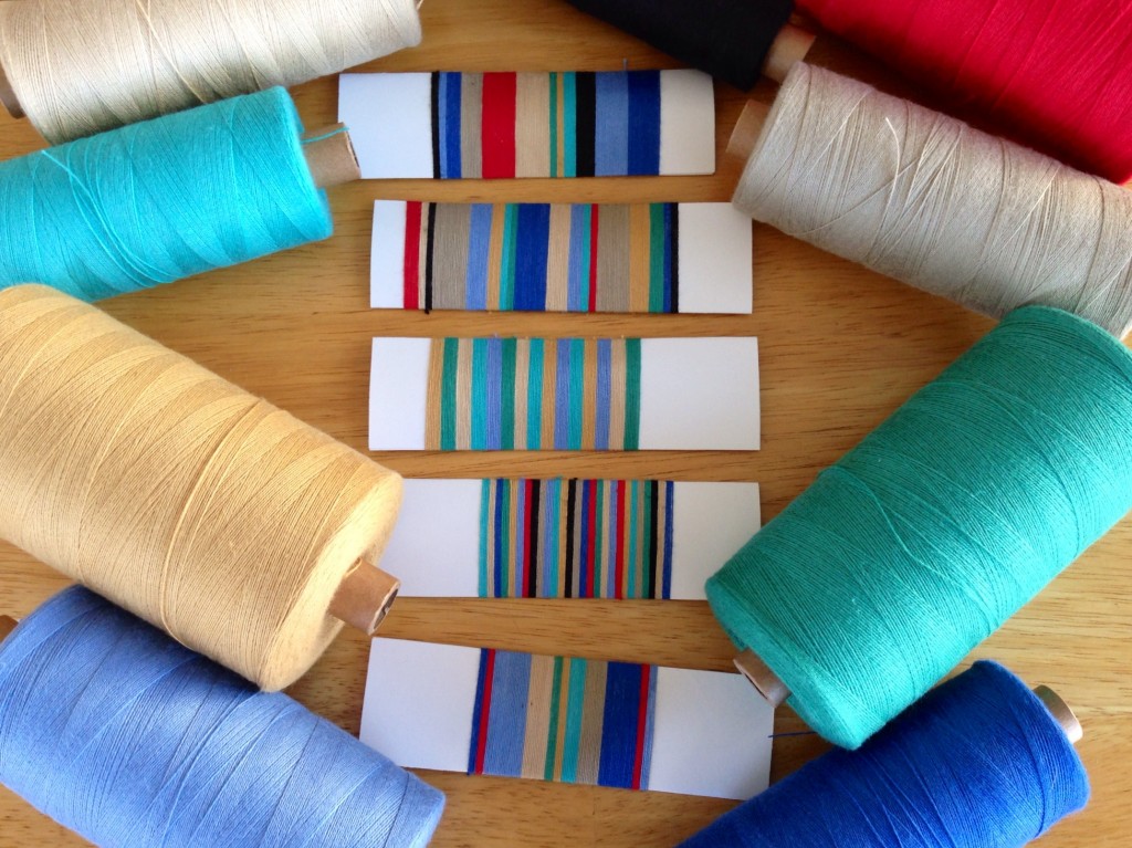
What would you do with nine colors of 16/2 cotton thread? Play with color, I hope! I have hand towels in mind, in a subtle three-shaft twill weave. I challenged myself to create a pleasing arrangement of stripes for the warp. Hmm, should I use a Fibonacci number sequence…or evenly-spaced stripes? Random color order…or planned color order? I came up with several possible color arrangements; each one is unique. You and I are colorful and unique, too.

I love considering the options at the start of a project in order to have the best results in the end. Maybe our grand weaver is like that, too. “This person will be given a subtle arrangement of colors, evenly spaced; that person will have more intense colors, passionately vibrant. This other person will be given a large stroke of turquoise, because my world needs more turquoise.”
The grand weaver has designed you with certain colors as a gift to you–for you to enjoy life. The way to take full advantage of that gift is by using your colors to serve others. First, receive the gift with open hands. And then, whenever possible, give your gift away.
Which of the five arrangements of stripes in the picture appeals to you the most? I’d love to hear your opinion in the comments! I am curious to see if the one I decided on receives any votes.
May you unwrap your gift.
Joyfully,
Karen

Number 2 and 5 looks best to me – can’t decide which of the two!
Well, Birthe, I had a hard time deciding which one to go with. I changed my mind three times. haha!
Thanks for giving your vote. I’ll reveal my choice next week. (I finished winding the warp last night.)
They are all beautiful – just like your descriptive comments about the colors of life. So very glad our paths have crossed.
Cyndi, I’m very glad our paths have crossed, too!!
These color cards makes me think of groups of people. All five of these combinations have a place and a time, both among people and in the things we surround us with.
How I perceive them:
Number 1 as a group that lacks balance and where most members have strong opinions.
Number 2 as a group with a strong leader and colorful members.
Number 3 as a balanced group working behind the scenes where all members play an equal role.
Number 4 as a balanced group with very high energy members…to the point of hyperactive 🙂
Number 5 is interesting…a group with a couple of strong but not so visible members (red) are keeping this group from falling apart despite its lack of focus and diverse members.
A hand towel is such a small part of our life; at the same time it serves an important function. It affects us every time we touch it, either it is drying off our hands or folding it after it has been washed. It affects us every time we glance at it in between uses. It affects us every time we open up the drawer or the cabinet door where it is stored.
My favorite is number 3. I would enjoy the balanced subtlety because a hand towel has such a quiet purpose despite its frequent use.
Other people see the world differently and would need different things in their life. Subtlety happens to bring joy to my life, you best know what brings joy to your life. There is not right or wrong here, just different.
I’ll vote for number 5, Have you tried to take a black and white foto, then you can see the balance between dark and light.
I like how the black contrast makes the other colors “pop.” But I think my favorite is the last one – kind of between the most subtle and the most bold. I’m trying to find the right balance in this transition period between my past occupation and where God is leading me next. I’ve applied for an open position with a local crisis pregnancy center. Pretty excited about the possibilities and the eternal impact it has.
It is very interesting to hear everyone’s point of view. I love the thoughts you are writing in the comments.
I agree with Elizabeth, that there is no right or wrong here, just preference. There is right and wrong, and there are preferences – and it’s good to know the difference.
Grethe, great advice! I didn’t even think of taking a black and white photo to see the balance. I’m going to try that right now.
Finding the right mix of colors in a season of life is a challenge and an exciting adventure. Way to go, Barbara!
I like the fifth combination of colors. It’s balanced, but has differences, like people in general.
Claudia, I like your observation!
I like the middle one. I’m not fond of dark colours in tea towels. However, this
year at our Guild sale all the dark coloured tea towels sold first! They are popular now.
I really like more natural colours. I am sure whatever you pick will be beautiful as they all look nice. Actually 16/2 cotton also makes a nice light weight scarf! Did some beautiful ones at a workshop last summer.
Judith, I’m glad to get your vote! I enjoyed reading your thoughts behind it.
I made scarves out of 8/2 cotton once, and they were too chunky. I think 16/2 cotton would be much better. I’ll have to put that on my list of things to try.
I like 3 and 5 best. Both are beautiful!
3 and 5 turned out to be most popular. They are my favorites, too. Thanks for weighing in!