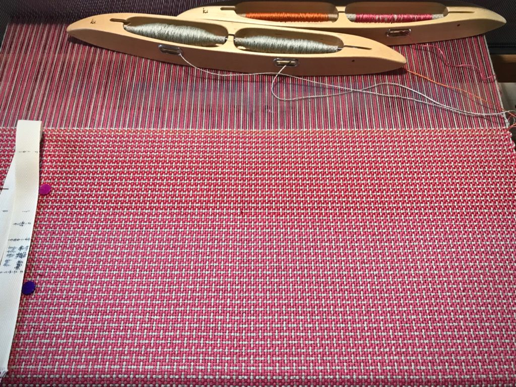
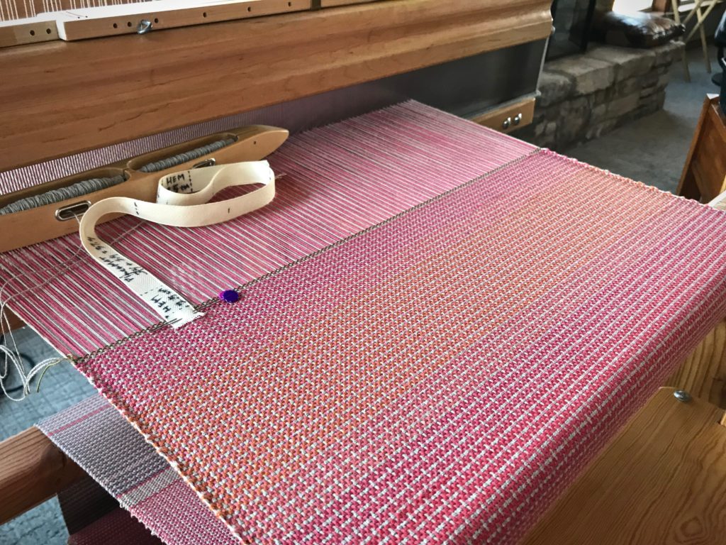
When I decided to use up some of the quills that have collected, I stumbled on one of my favorite techniques—color gradation. The weft colors change gradually instead of making distinct weft stripes. Remember the placemats on the little countermarch loom? I am weaving the last few.


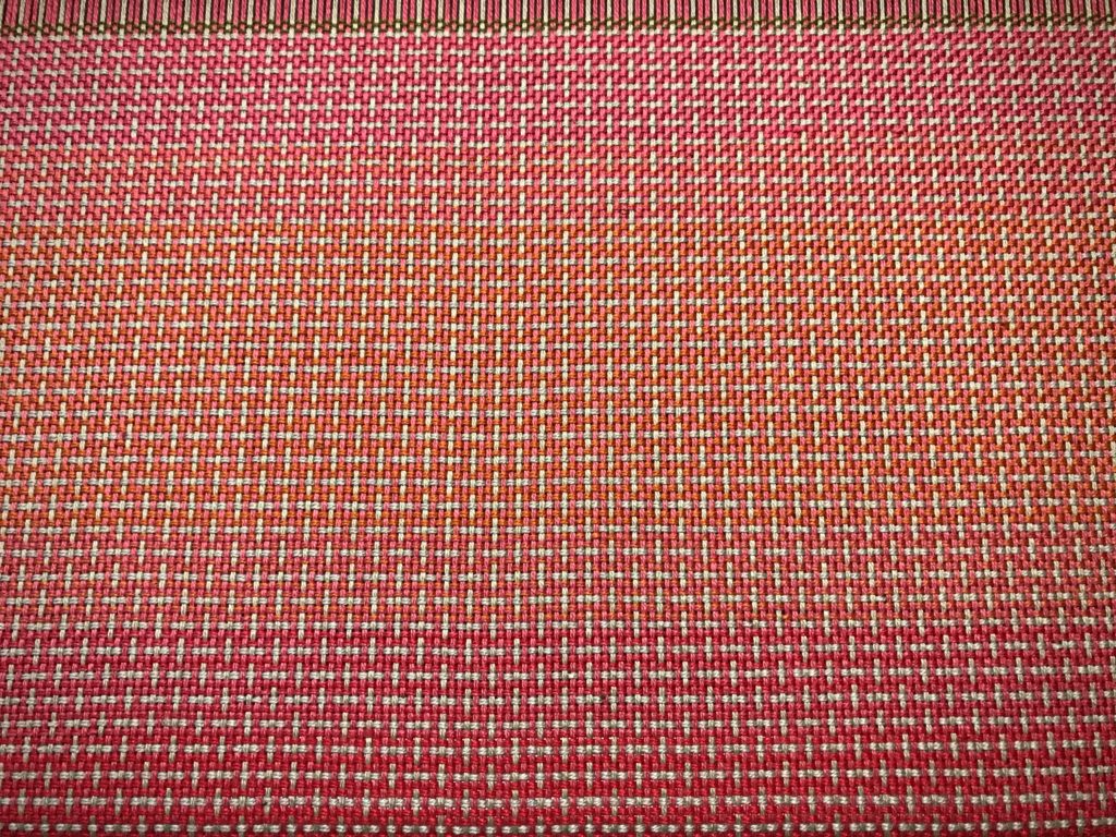
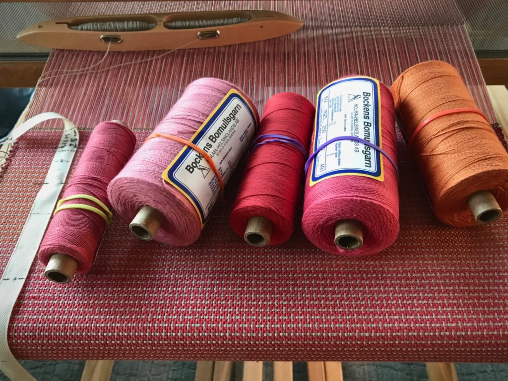
The quills on a double-bobbin shuttle don’t always empty at exactly the same time. The quill that has thread remaining on it goes in a box for later use. Those quills in the box are what I’m using here. For this placemat I’m letting gradient color changes happen in varying increments, according to the amount of thread left on the quill. I have five shades of 8/2 cotton, ranging from coral pink to pumpkin.

This is the perfect setup for some subtle color gradation: Five closely-related hues, a double-bobbin shuttle, and a supply of leftover quills. For best effect, I arrange the colors in order, from light to dark, or dark to light.
Color Gradation
- Weave a section with two quills of color A (the lightest color)
- Weave the next section with one quill of color A and one quill of color B (one shade darker than color A)
- Weave the next section with two quills of color B
- Weave the next section with one quill of color B and one quill of color C (one shade darker than color B)
And so on…
What could be simpler?

May you make something beautiful with the little bits that you have.
Happy weaving,
Karen

Such a lovely way to play with color. I often transition from one color to another without a hard line by weaving 1 pick with new color, 4 picks with old color, 2 picks with new color, 3 picks with old color, 3 picks with new color, 2 picks with old color, 4 picks with new color, 1 pick with old color and transition complete. Will try your double bobbin change next time I am ready to play with colors. Blessings during this advent season, Ruth
Hi Ruth, Thanks for sharing another way to transition the colors. That’s a great way to achieve a lovely gradient.
It would be fun to do a sample piece with various ways to do color gradations. Or, that would be an interesting study group project.
Advent blessings to you,
Karen
We turned on the Spurs game the other night and I took one look at the other team’s uniform and said “gradient!” Not something you often see in a basketball uniform, lol.
Love the placemat!
Hi Betsy, That’s too funny! Who else is even going to notice such things? …unless we call it the popular name-“ombré,” meaning shaded in French.
Happy weaving,
Karen
I realized on a recent project the subtle transition between two light colours, in different tones added depth. I decided to shake up the mix and make the transitions much narrower in the next project and didn’t have as near an interesting effect. It needed large areas each for contrast.
I love your pattern too
Hi Vivian, I have noticed the same thing. The areas with a longer transition make more satisfying gradation.
Thanks for your input!
Karen