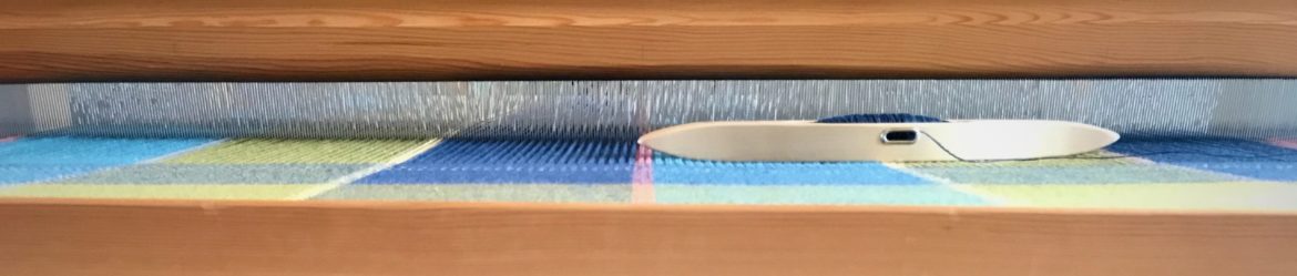
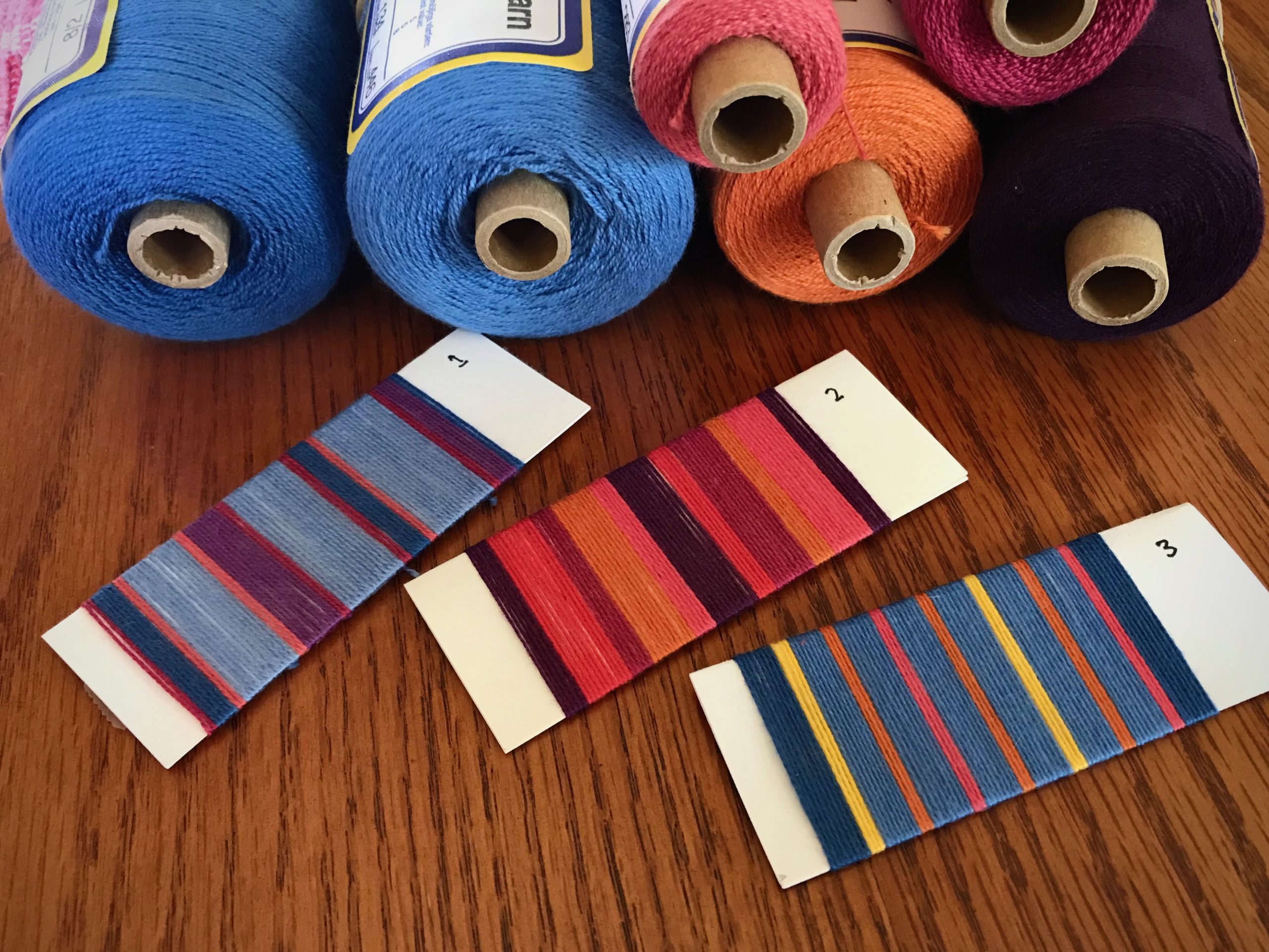
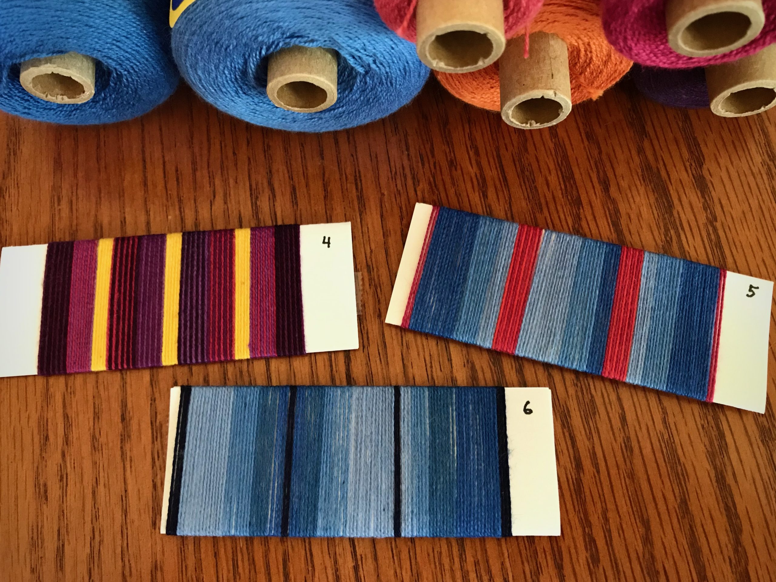
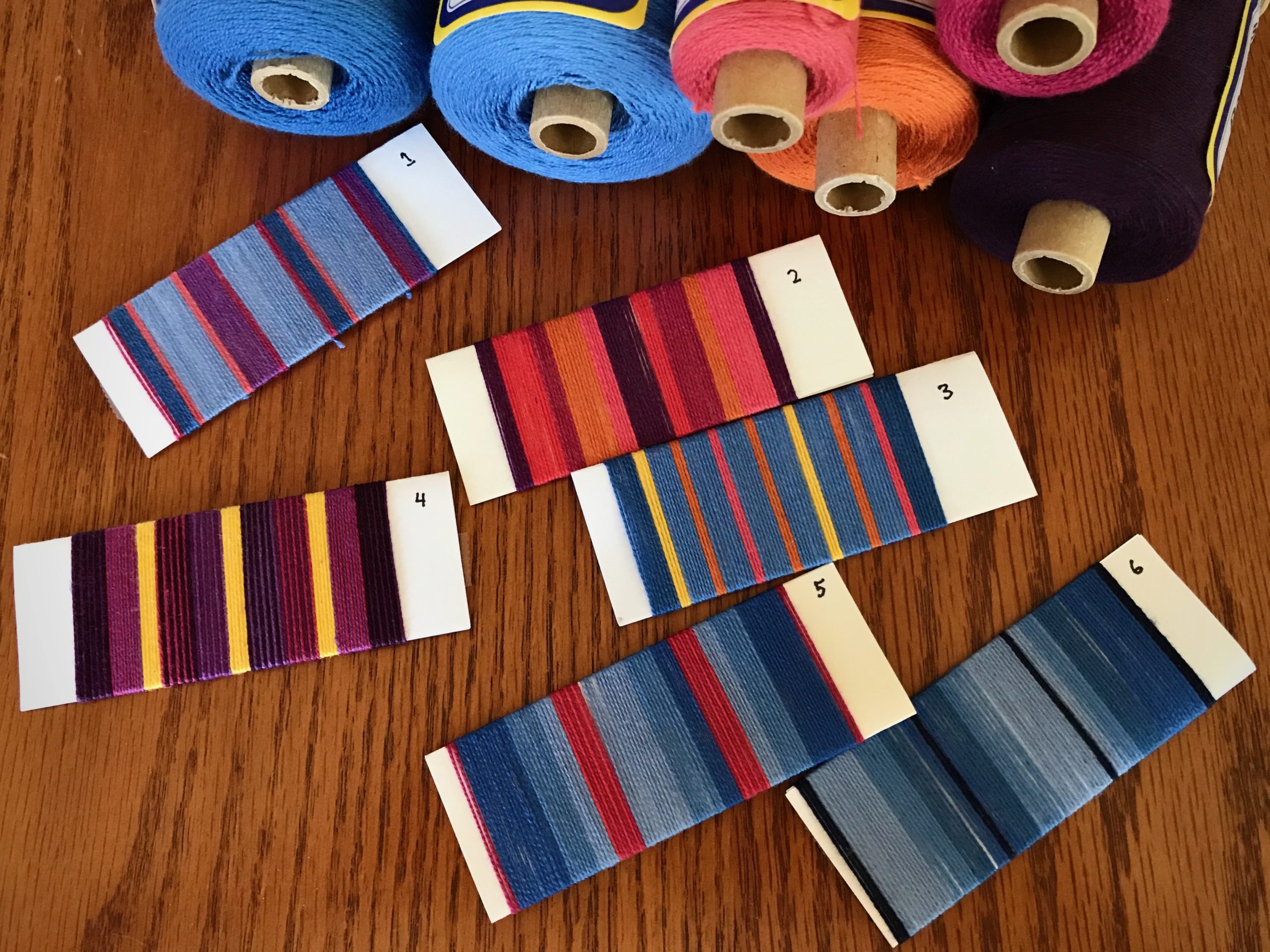
When I wrap potential warp sequences on folded index cards it brings design thoughts out into the open. It makes the ideas tangible, helping me plan a pleasing warp. For this 8/2 cotton warp I am choosing colors from the plentiful selection I already have on my shelves.
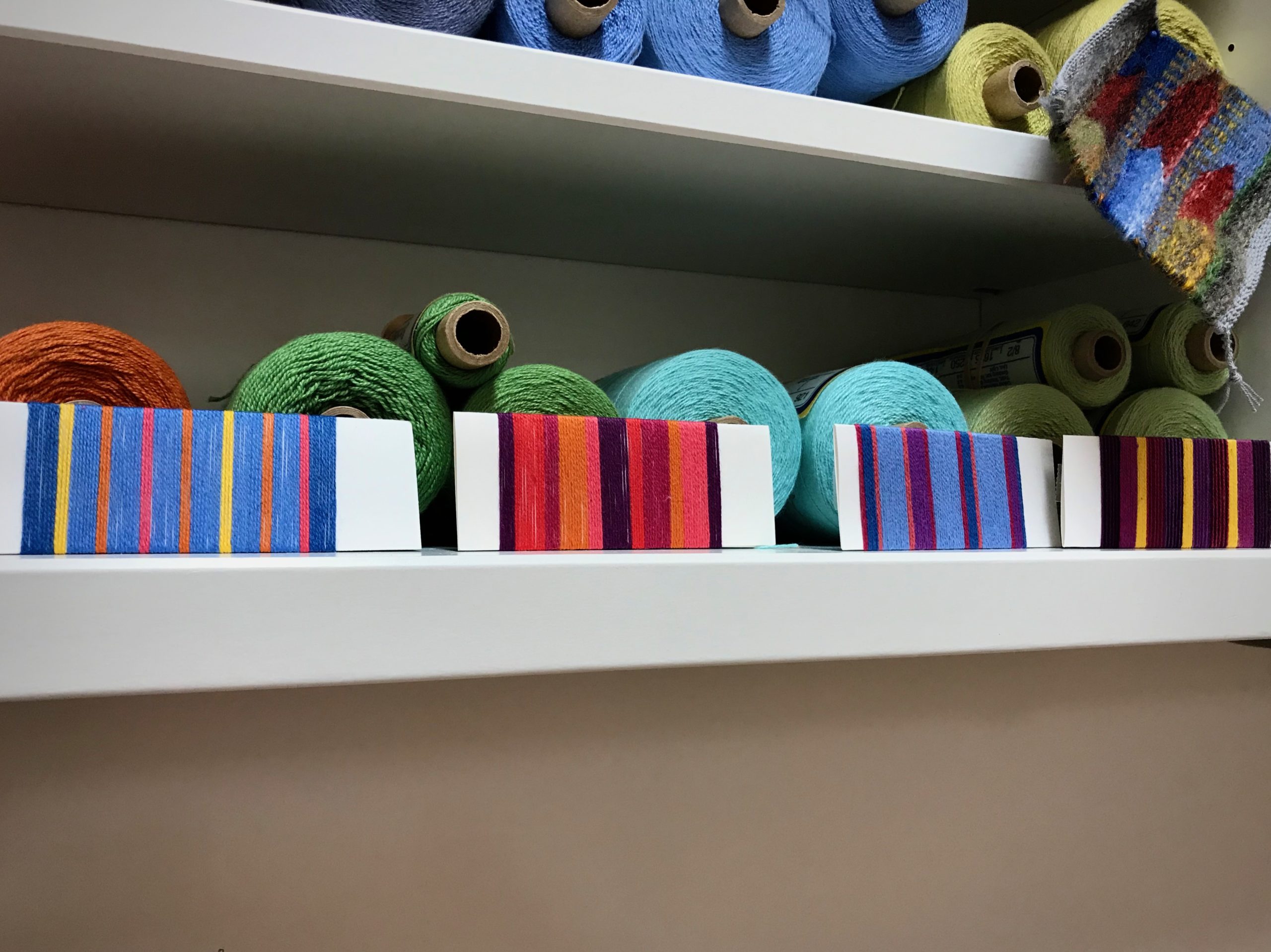
This warp will be woven as eight-shaft–twill yardage, about 15 1/2 inches wide. The fabric will be cut and hemmed to make colorful arm and headrest covers for my mother-in-law’s comfy off-white recliner. I will increase the width of the stripes proportionately to fill the warp width. My mother-in-law will have the final say, but if you could help her decide, which set of warp stripes would you choose? Please let us know in the comments.
What if our attitudes were made tangible? What would our thoughts look like if they were out in the open, wrapped like colored threads around our actions? With the love of Christ in us, forgiveness is the recurring thread. Forgiveness is for the undeserving. That is who we forgive. Because that is who we are when we are forgiven by God.
May the thread of forgiveness be woven in your life’s fabric.
With you,
Karen
Hi Karen,
I have enjoyed your weaving and your threads of wisdom for quite a while. This post on forgiveness is on target . Thank you for your insightful messages. I would choose the blue with salmon , yellow and orange. The yellow stands out like sunshine (Sonshine) of God’s forgiveness.
Hi Jo, Thank you for letting me know you are a part of this weaving journey. I enjoy hearing your reason for your choice of the warp wrappings.
Hugs,
Karen
A very good reminder. We forgive because we are forgiven.
The wraps are so beautiful in themselves. I lean toward 1 or 3 or 5…..blues with pop of color. It will be fun to see what your mother-in-law picks!
Hi Linda, One can never go wrong with blue. Making these wrappings is such a fun exercise.
Happy weaving,
Karen
#2 and my reasoning is simple – bright, joyful and a reminder that your warmth and loving arms are surrounding her with the skills you have to share. Blessings!
Bethany in Kingston ON Canada
Hi Bethany, Your reasoning is so heart warming!
Thank you!
Karen
Good morning Karen,
Prefaced with not knowing what else is in the room and color preferences of your MOL…I am drawn to number 2.
The warm colors bring a spark of excitement to the a
off white chair.
Hi Nannette, I know she enjoys colorful things, so you may be on target. Excitement is a welcome sentiment.
Thank you,
Karen
I look forward to reading your wonderful words each time you post. You inspire me to weave and be a better person! I would choose #3 and #5. I like the play of blue with the red and yellow.
Hi Maria, I’m encouraged by your kind words. It’s a joy to have you along. Thanks for giving your opinion on the warp wrappings.
All the best,
Karen
I agree with Karen. #2
Hi Patricia, That’s a good choice.
Thanks,
Karen
#2 or 3. Like the pop of color in both. Hard to say tho without knowing what other colors are in her room. I’m sure you’ve considered color with all your selections.
Hi Ellen, You are right, I tried to include colors that would work in her room. And I didn’t include green at all because I know it’s not one of her favorite colors.
Thanks for participating,
Karen
For me personally I would pick 2 or 3. I like lots of color. If she doesn’t like as much color then 6 has potential as you get variations of blues with a touch of black. A more restful but interesting warp.
Hi Linda, I included #6 for the very reasons you describe. It truly does look very restful. The black is actually navy blue. The iPhone camera does pretty good, but just can’t get it quite right. Thanks for your thoughtful response.
Happy weaving,
Karen
Good morning, dearest!
As I picture the off-white recliner…#6 seems to pop in my mind. It would hide possible soil marks and be stunning against the recliner. But, then…you might want something more cheerful. What is her personality? What are her favorite colors, I wonder. No matter the color choices…the end product will surely bless her more than there are color choices to make.
Hi Charlotte, I like your reasonable approach. Yes, there are several factors to consider. Personality – delightful and fun. Favorite colors – I know she favors blue, and also likes other colors in colorful things. It will be a great pleasure for me to make these for the woman who has enriched my life so much.
Thanks,
Karen
Good morning, Karen.
Rather a scary premise to have all of our thoughts out in the open for everyone to see! However, I do believe that God sees them all and that knowledge keeps me working on improving.
My eyes keep returning to wrap #3. Bethany said it best, though, when she said any of them will be a reminder of your warm and loving arms around your mother in law. She is very blessed to have you for a daughter in law.
Can’t wait to see what she chooses.
Hi Annie, Thankfully, God’s grace through Jesus supplies what we need to live for him. I’m glad to know your choice on the wraps. Yes, Bethany had a sweet way of expressing it.
Thank you,
Karen
Number three for this old lady. Blue for the sky of Heaven, yellow for the Light that shines upon us all, and red for the love of our Maker. Back to the primary, cheerful colors, unmuddied by doubt. Lucky Mama to get such a thoughtful gift!
Hi Joanna, Excellent!
Thanks,
Karen
Good morning Karen
I choose No 2 for your MIL to wrap around her gentle precious body.
I enjoy reading your posts, thank you for your inspirations.
Hi Jan, I am pleased to receive your “vote.” It’s a joy to hear your sweet encouraging words.
Thank you,
Karen
When I saw #3, my immediate thought was that I need to remember this and use it on something sometime. Charlotte is right about the blue #6, very practical and blue is very calming. But that #3, I really like it.
Joanne
Hi Joanne, I, too, like #3. It seems well balanced and tidy, and most of all, cheerful. When I finished wrapping that one, it felt very familiar, as if I had done that same arrangement before. Maybe my memory copied a previous project?? 🙂
Thanks for your input,
Karen
Hello, Karen! I like #1, which reminds me of a lovely sunset after a summer day filled with everything I love to do; #4 with a nod to the bright yellow that shines out of the dark contrasts, the light with which we are all acquainted; and am drawn to the orderliness of #3.And thank you for the gentle reminder of the importance of ‘forgiveness for the undeserving’. Important, yet challenging. I will work on that.
Hi Mary, Oh yes, I can see the summer sunset in #1. What a wonderful description that fits. And the bright yellow in #4 does make the whole arrangement shine. Yes, #3 seems tidy to me, as I mentioned to Joanne. So many aspects to consider!
Forgiveness for the undeserving is extremely challenging. I’m thankful we have been given an example.
Thank you,
Karen
great idea. I hate doing samples but I could handle wraping the warp around cards.
Thanks
Jenna
Hi Jenna, This is very easy and pretty fun. I fold a regular index card in half and put double stick tape on the back side to hold the threads.
Happy wrapping,
Karen