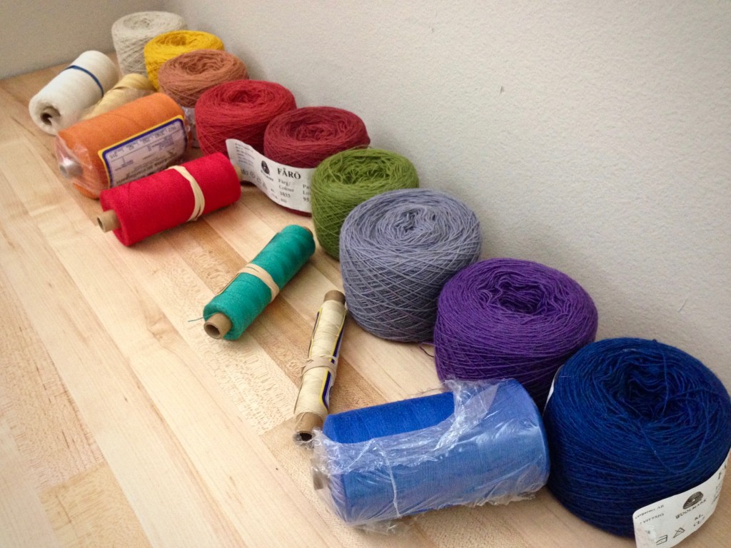
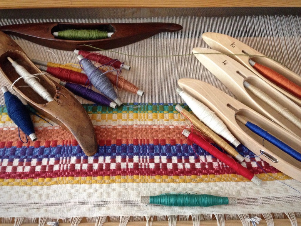
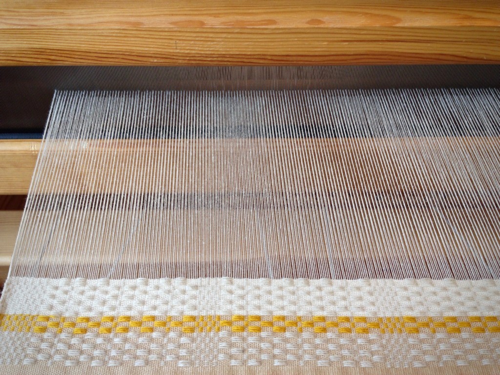
I have forty-five shades of Fårö wool. That’s better than a giant box of crayons! Monksbelt and Fårö wool–is there anything better?! I have narrowed it down to nine colors. For the weft rep ground weave, a few tubes of 16/2 cotton off my shelves will do nicely.

As always, I sample to see what works, and what doesn’t. I want a collection of colors that make a strong, but peaceful, statement. One misplaced color will spoil the effect. After trying various wool and cotton combinations, I see that the teal cotton must be removed. This color is welcome in other settings, but here it is out of place.

Faith is like a determined collection of colors that are meant for each other. Do not underestimate the power of faith. When lined up like close-knit friends, when put into action, when woven into the warp, it’s phenomenal! However, faith is strongest when fear is removed. Taking the teal out of the lineup makes all the difference. Now, I weave this with confidence, knowing it works. Have you heard the account of Jesus calming the storm? He told the wind and waves, “Be still.” Strength and peace. That’s the power of faith.

May you find the color that needs to be removed.
With strength and peace,
Karen

What will you make? Love Monksbelt!
Hi Eva, Thanks for asking!
I am weaving this monksbelt with no end product in mind. I will wait until I can hold the fabric in my hands to decide how to use it. Right now, the pleasure is simply in the weaving.
Happy weaving,
Karen
45! I’d love to see a picture of your fiber storage area…. I’m sure you have lots of other goodies as well. I love monksbelt too, but usually have issues with the selvedge. It looks like you have it well under control.
Debbie, I know. I’m embarrassed to tell how much Fårö wool I have. I have collected the colors little by little for doing my small tapestries. I love having a wide range of colors for that.
Fiber storage – I do have a great system that a dear friend helped design for me. My Fårö has overflowed its space, though, and half of it has drifted into a large box on the other side of the room. haha!
A post on some storage solutions is a great idea! Thanks for the idea.
So far, the selvedges are not giving me too much trouble. The temple helps with that.
Karen
Beautiful! And I agree in the teal! It doesn’t contribute to balance…or peace. The green/teal combination speaks a different “language” than the other color combinations.
On storage, a few ideas:
Before looking into storage solutions: Reduce! Weed out anything that doesn’t meet your need any more! Did something already serve its purpose in your life and will now serve someone else better?
Can you add shelves to your existing system or did you already utilized every inch of height between the existing shelves?
You love color palettes as much as I do…would displaying your yarn in wall hung shallow wooden boxes be an option?
Would it be more functional to move yarn back into the existing storage system and take something else out to be placed elsewhere?
Is it an option to sell yarn to other weavers to reduce money held up in inventory and set the money aside for future yarn needs 🙂 Full price by weight…maybe half the amount of each color goes a long way. This could be done for any yarn/thread that’s not used a lot.
Do some items take up too much space by sitting in a box that’s too big? Would some items be better off on a small wall shelf as a “piece of art”…like clamping a bobbin winder to a small colorful shelf for example. Or hang extra heddles on decorative pegs?
And last but not least, I really like the flexibility of the IKEA Ivar system. Shelves can be placed as far apart or close together as you need. And, you can cover the side(s) with wood or a peg board and have functional wall storage.
Have wonderful weekend!
Elisabeth
Sent from my iPhone
Elisabeth – This is why I love hanging out with you! Your advice is priceless.
For the Fårö situation, I think it’s time to weed out some old yarn that is not the quality I like to use. It’s just taking up space. If I do that, I think I can make room to put all the Fårö together. 🙂 You’re brilliant at pointing out the simple and obvious. …and at asking the hard questions.
Thank you!
Karen
Karen: You must be too close to your weaving to decide about the teal, from Massachusetts it looks wonderful! Sometimes just a hint of that “off” color makes the others sing. Back up 20′ and squint. What do you see? LP&J,linda
Okay, let me try that. I’ll be right back…
Linda, I see what you mean. From a distance, the teal color doesn’t seem as harsh against the wool green. I know exactly what you are talking about that a hint of an “off” color can add a vibrant touch to the fabric. I’ve experienced that a few times, too.
Hmm… I think I will set the teal aside–mostly; after all, the fabric will be seen close up most often. I may, however, sneak in a small bit of the teal as a surprise element. We shall see…
Thanks for the feedback,
Karen
I agree with Linda on the value of using an off color, I do it in my quilts all the time, it is easier when using an array of colors in a large project. With fewer colors and a smaller project (small compared to a king size quilt) a hint, like Linda says, would be the way to go.
Thank you Linda for reminding me of the value of the off color! I am too new to weaving, and hung up in the process, to apply my color experience from other areas yet. Good reminder 🙂
Elisabeth