Tried and True: Five Reasons Sampling Makes Sense

Why sample? It means using more warp and weft. And it means waiting longer to start to the “real” project. What do I gain from it, anyway? Is it a waste of resources and time?

I can’t imagine putting on a warp that didn’t have room up front for sampling. There’s more than one reason to put on sufficient warp to weave a sample. It makes perfect sense, especially if there is anything new or unfamiliar about your planned project.

Five Reasons to Add Extra Warp for Sampling

Drawloom
Sampling to test patterns, weft colors, and beat consistency, before starting on fabric for a garment.


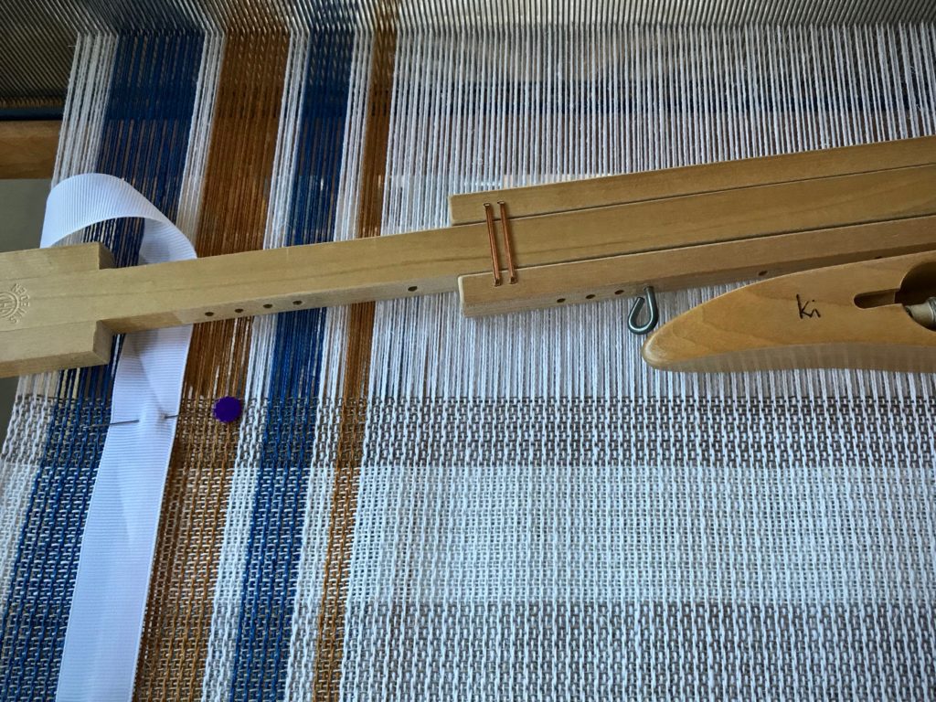
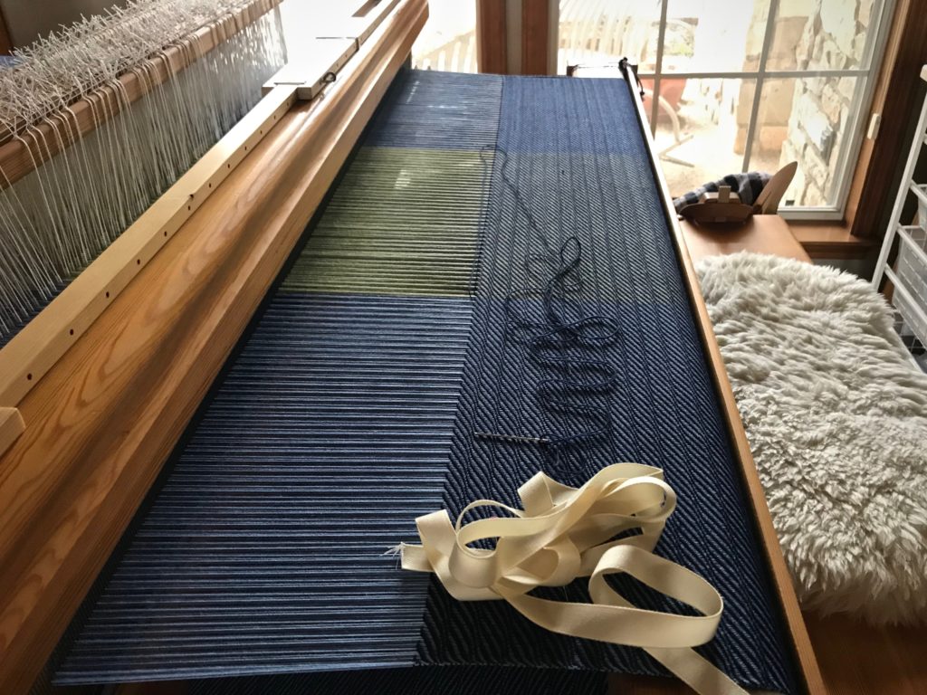
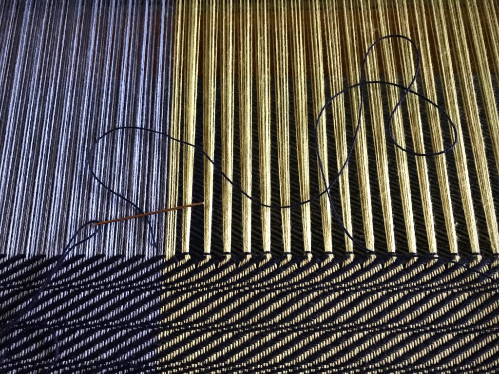
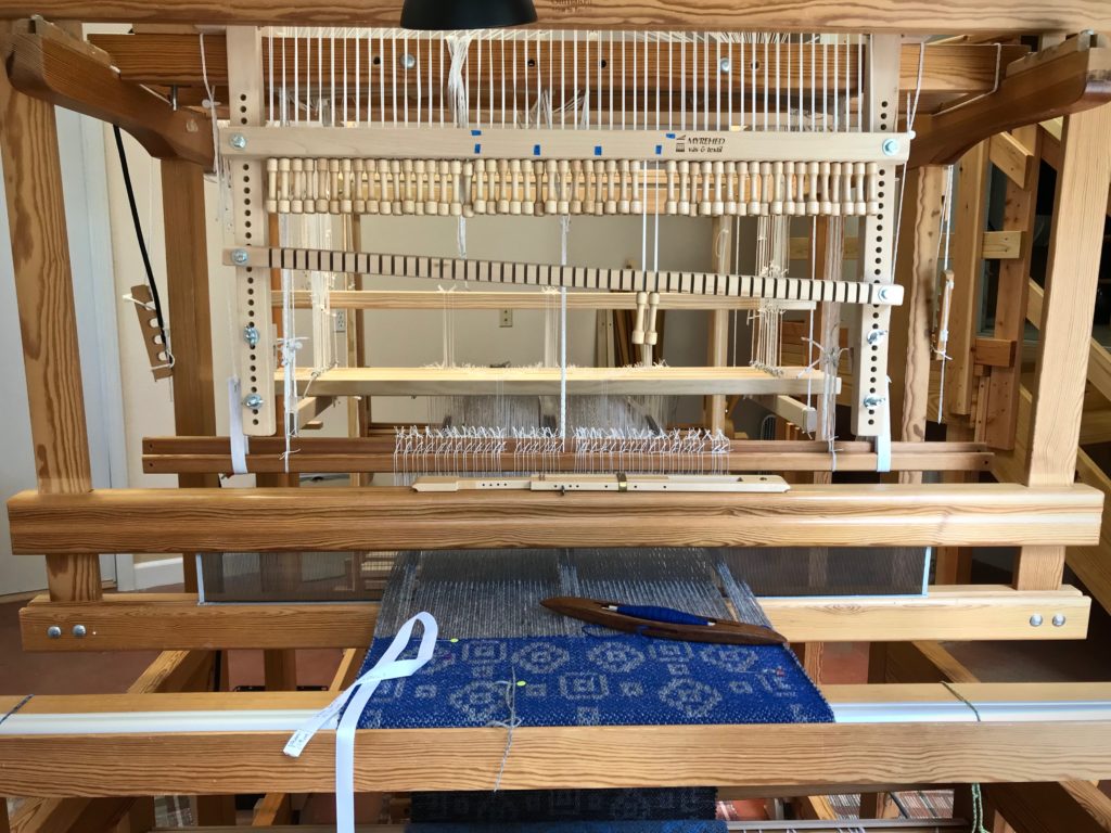
1 Space to play. I want plenty of room to play, and to practice techniques that are new to me.
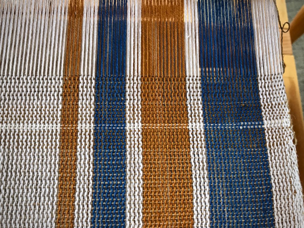
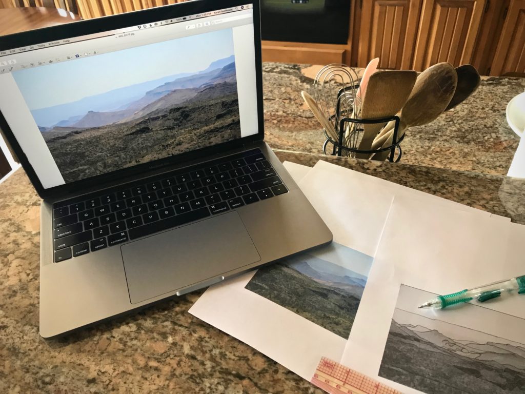
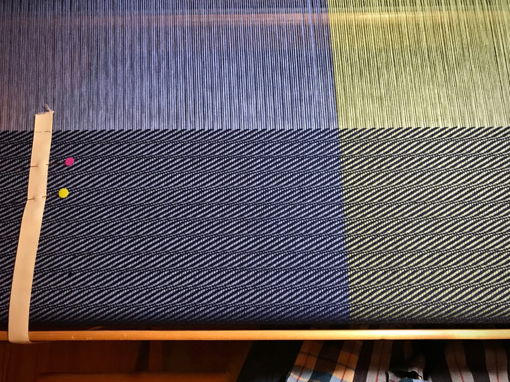
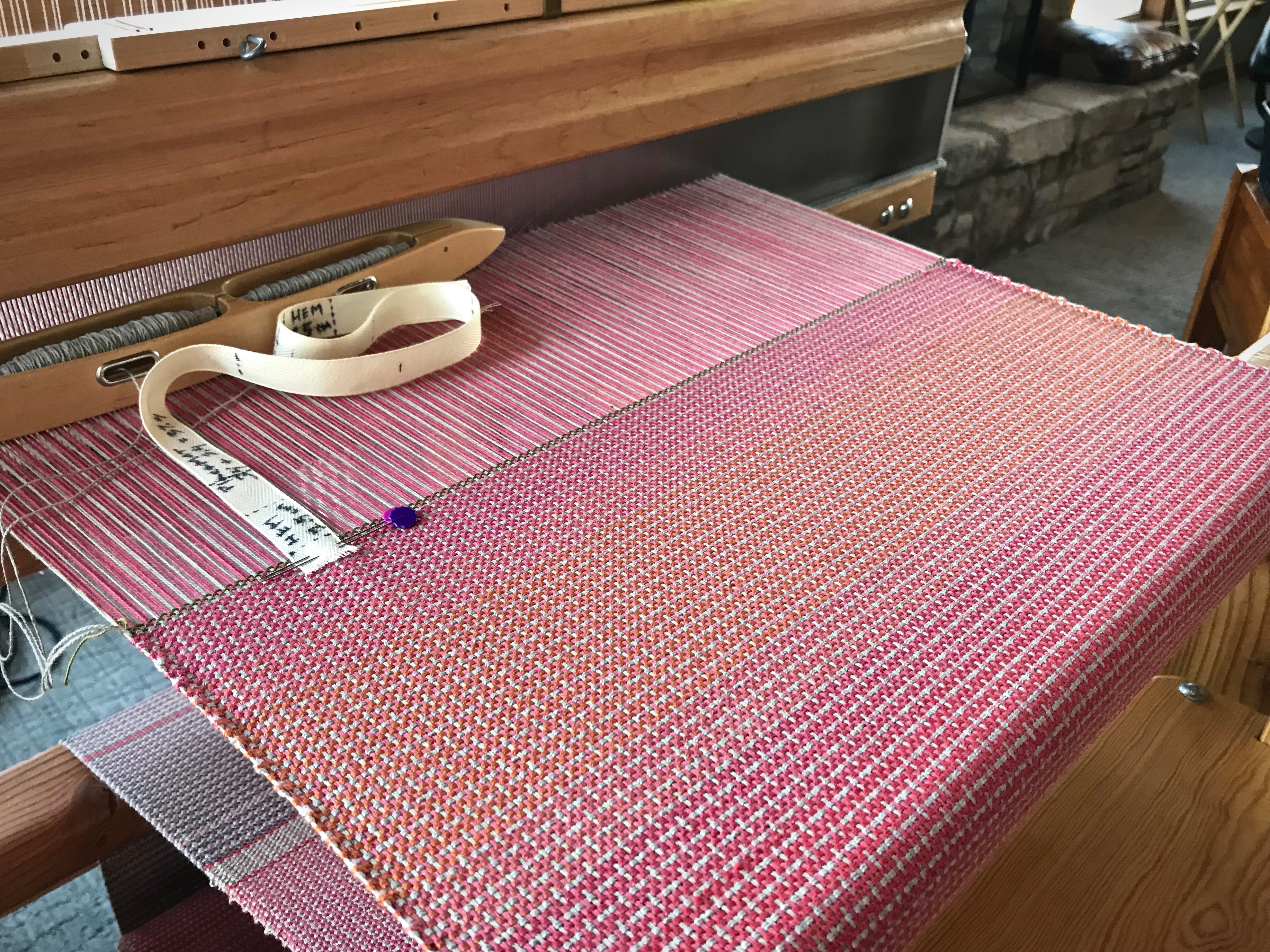
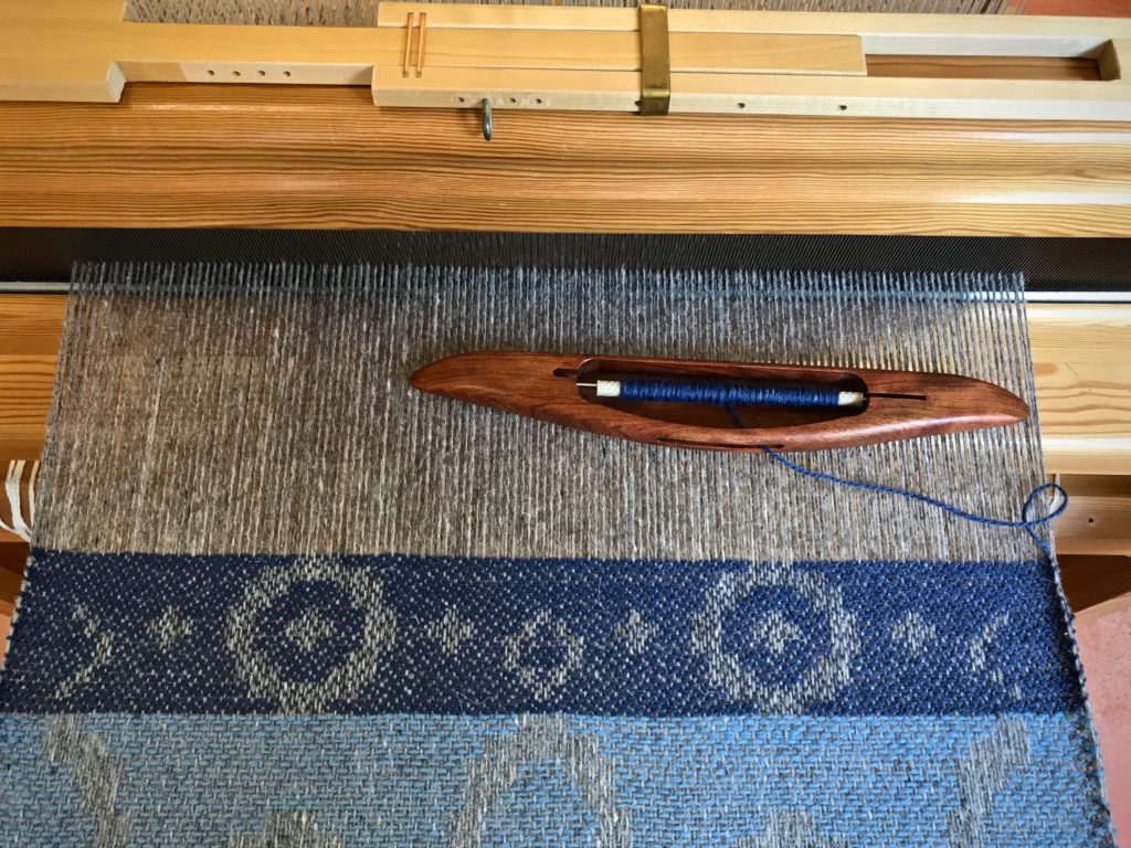
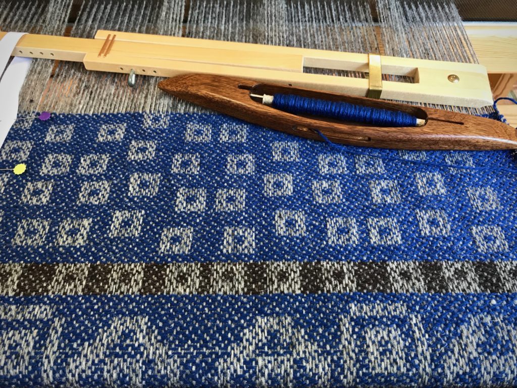
2 Room to try out designs. By weaving a portion of my designs, I am able to determine what works, and what adjustments need to be made.
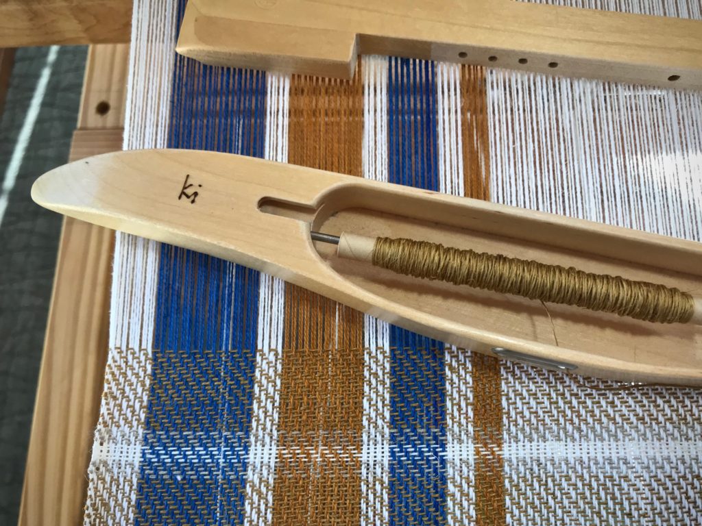
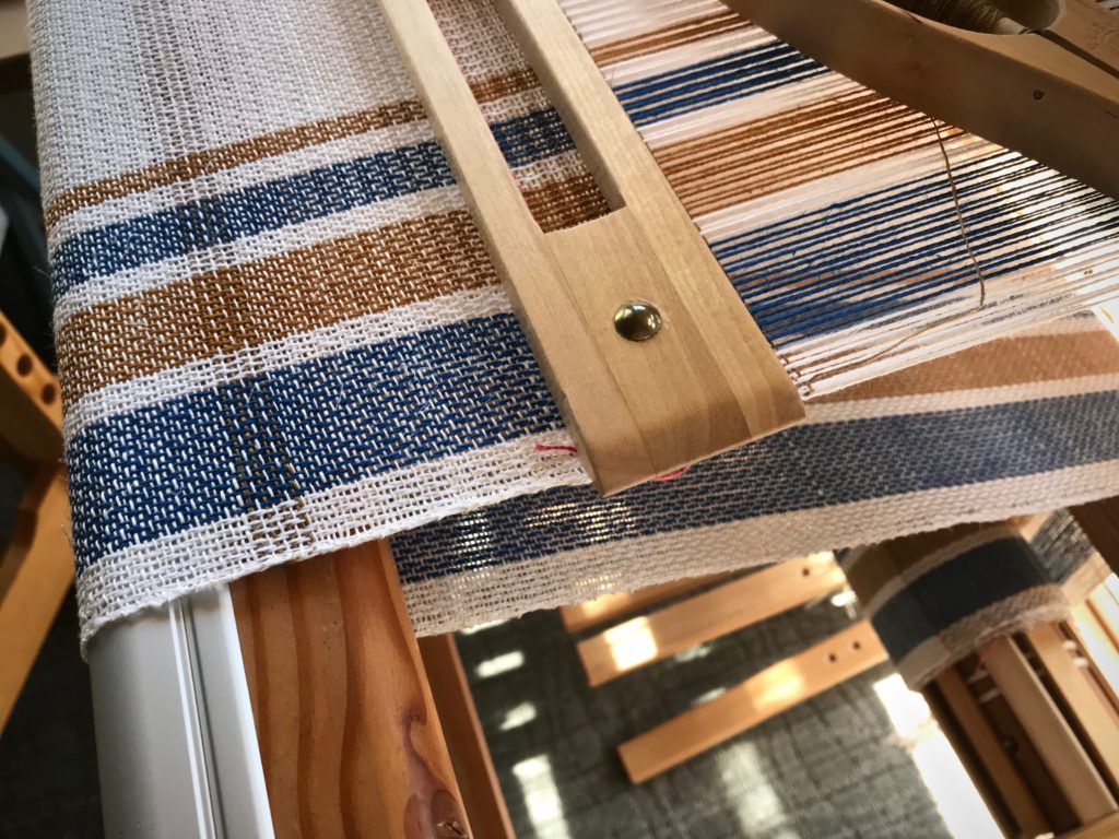
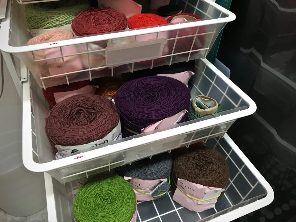
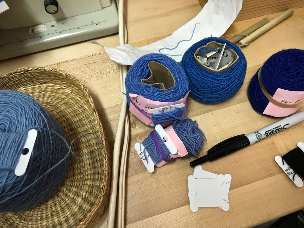
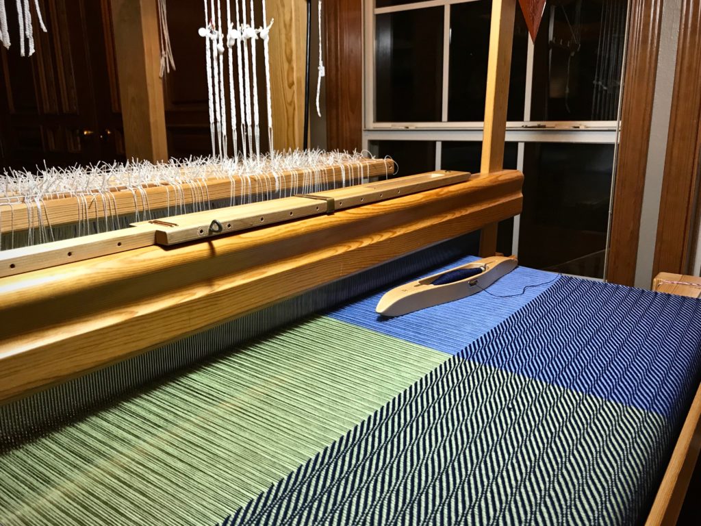
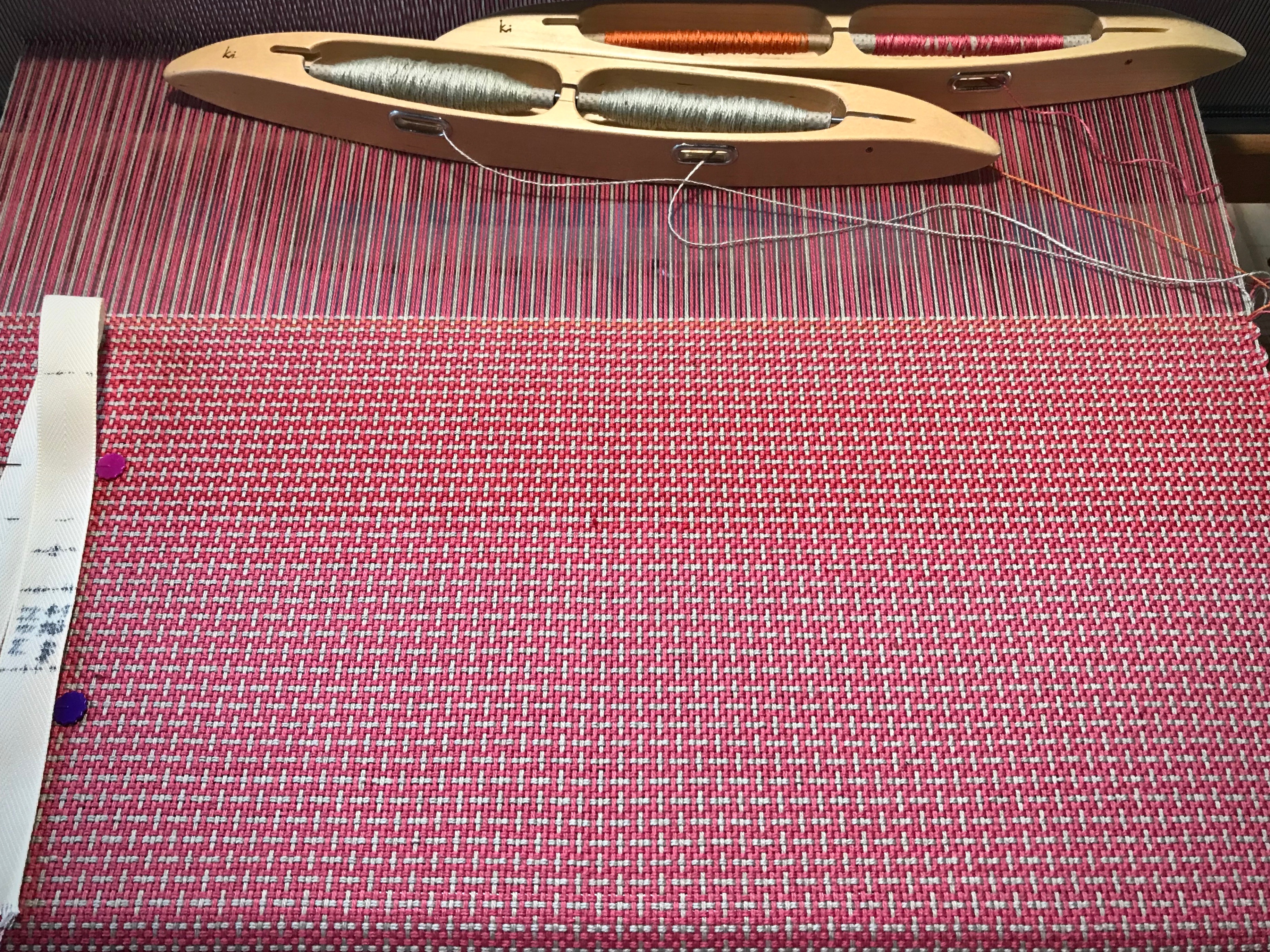
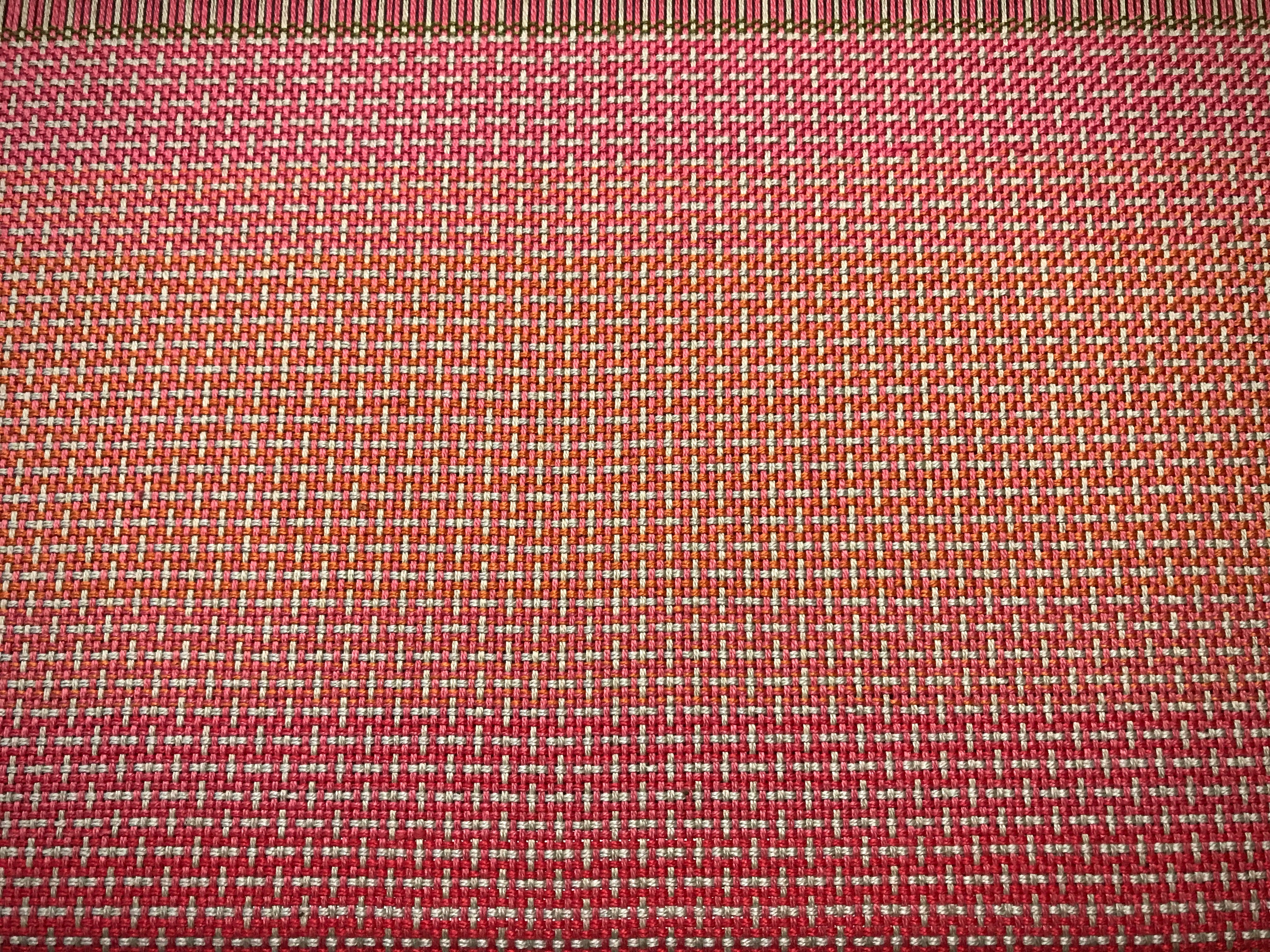
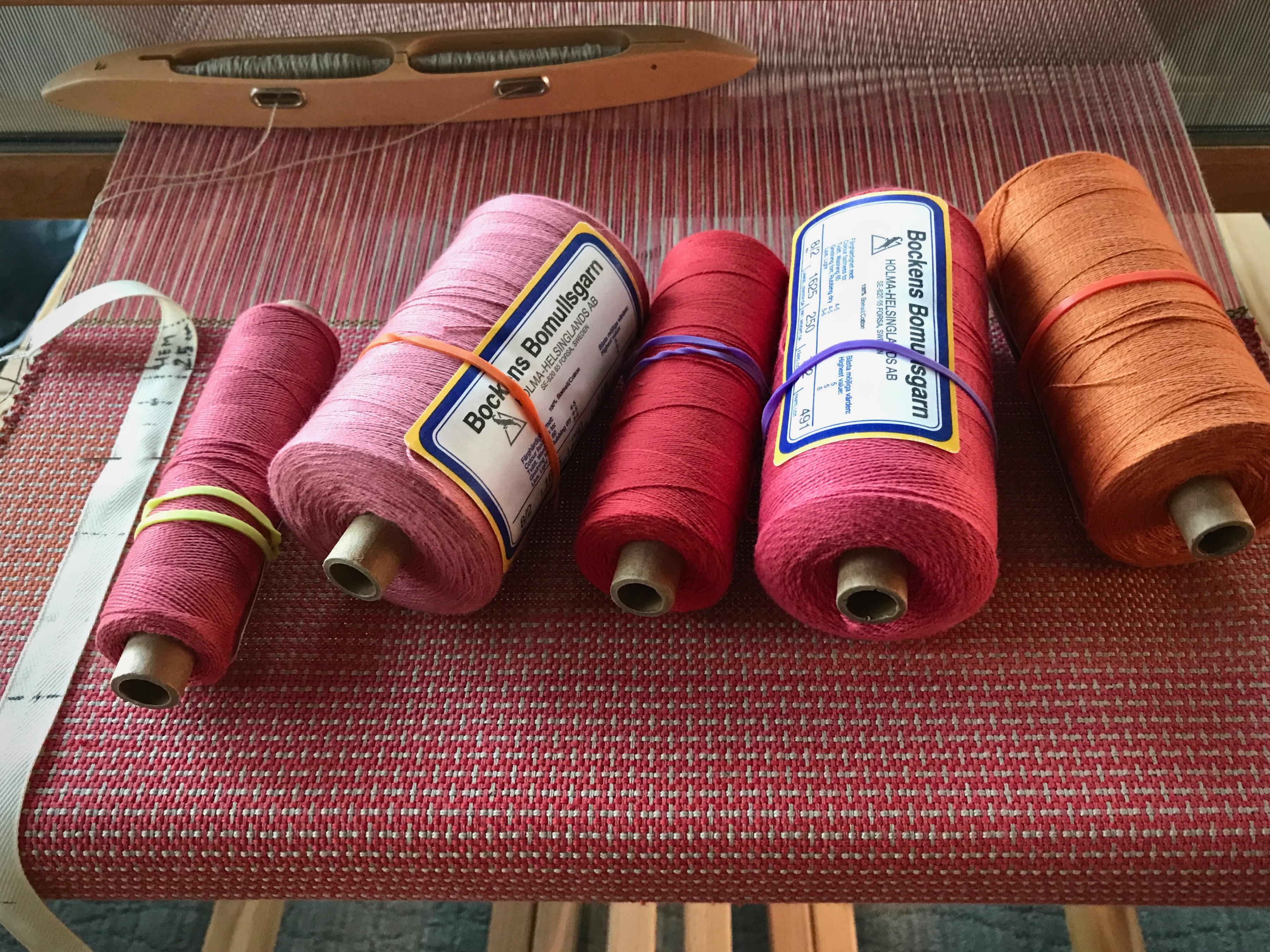
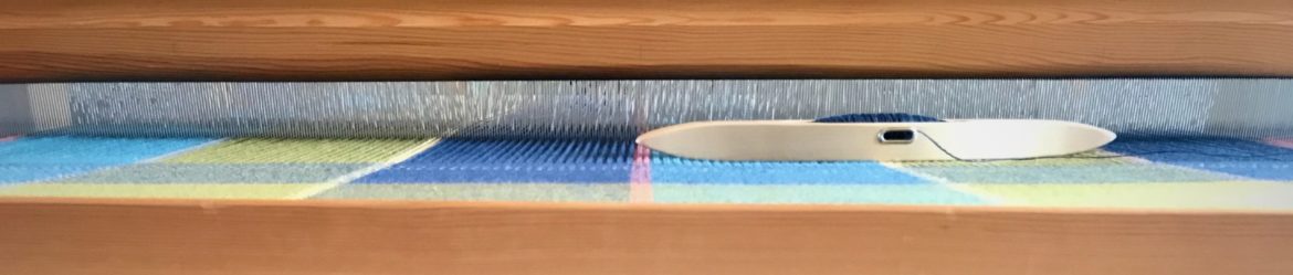
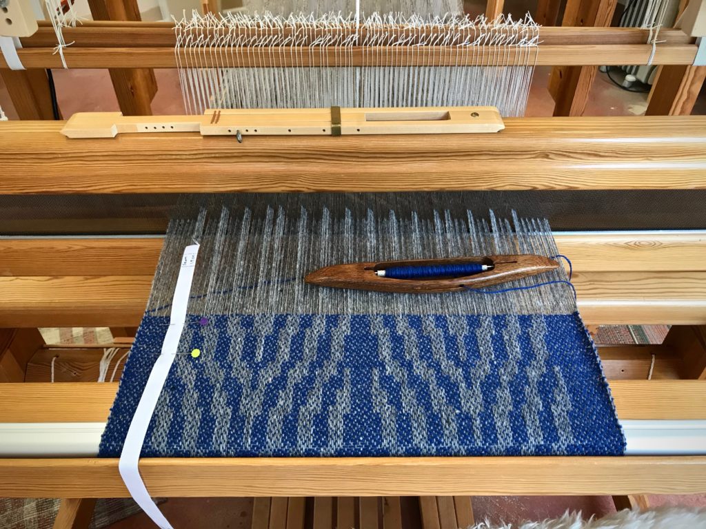
3 Warp for testing weft colors. Only when woven can I see the full effect of each potential weft color.
4 Time to gain a consistent beat. When I start the main project, I want to have woven enough to be able to “feel” how firmly or softly I need to move the beater.
5 The best reason of all! It’s always good to have enough warp on the loom that you can invite friends and family to enjoy some weaving time. …Before your main project is in progress.

Drawloom
My weaving friend Betsy came over to see what it is like to weave on a drawloom.
Drawloom
My daughter Melody came for a visit and wanted to see what it was like to weave on a drawloom.
Drawloom, making garment fabric.
Garment fabric. This is to be used for two side panels of a vest I plan to make for myself.
Drawloom, making garment fabric.
This is to be the back panel of the vest.
Drawloom, making garment fabric.
This is the beginning of the front panels for the vest.

May you give yourself room to play.

Yours truly,
Karen

Weaving Some Simple Borders

I need to free up this little loom in order to put on a different warp that has a deadline. So, now that I have returned from my travels, my attention is going to these towels. My friend is letting me weave this lovely cottolin warp that she got at Vavstuga.

Simple border stripe in first towel of the Vavstuga towel kit.
Simple border stripe in first towel. Straight twill.
Cottolin warp and 8/1 tow linen weft.
Point twill on four shafts.
Point twill on four shafts. Three horizontal stripes made with half-bleached tow linen weft.

Straight twill, point twill, broken twill, and now “rick-rack.” And after that, a couple towels in plain weave. Everyone who weaves this Vavstuga towel kit and follows the instructions will end up with the same six towels. True? Not necessarily. I like to step off the expected path. That is why I vary the weft and include some type of simple border design on each towel.

Loom with a view. Texas Hill Country.
Three colors of 8/1 tow linen sit on the little blue table as choices for weft. Half-bleached, Unbleached, and Bronze.
Broken twill for a cottolin towel.
Changed the tie-up to broken twill, which allows me to keep a simple straight treadling pattern. Dashed weft pattern for the border stripe is produced by alternating the bronze linen weft with the half-bleached linen weft.
Color-blocked towel uses three neutral weft colors.
Long wavy vertical lines give the appearance of rick-rack. Again, I changed the tie-up to keep the simple straight treadling pattern. I use all three weft colors in this color-blocked towel.
Cottolin towels with 8/1 tow linen weft.
Plain weave, with four shafts and two treadles. The main body of the towel uses the unbleached linen weft. Two picks of half-bleached linen are sandwiched between several rows of bronze linen weft.

There is a wide path that is crowded with many people. It’s the common and expected way of life. It’s where you stay if you want to fit in with everyone else. But if you search for it, you’ll find an uncommon path. It’s narrow; and few find it. It’s the path of life that is found in Jesus Christ. Stand in the narrow path. That is where your unique features will show up as border designs that set you apart as a cherished child of God.

May you be set apart.

Happy weaving,
Karen

Travel Weaving to Germany

I am turning right around to head out on another travel adventure. This time it’s Potsdam, Germany and Innsbruck, Austria with my sister Barbara. You know what that means—prepare my smallest tapestry frame for travel weaving. Besides the loom, I need necessary tools, warp thread, weft yarn, a cartoon, extra paper and pencil, book light and extra batteries, and a small bag in which to carry it all.

Fresno Canyon in Big Bend Ranch State Park is breathtaking. Steve captured the awe last week with his Canon Rebel T3i Digital SLR camera. My dream now is to capture the view in yarn. I am making a cartoon directly from a black-and-white print of the photograph.
Choosing Fårö wool yarn for a tapestry.
My Fårö yarn is housed in three baskets of an Elfa cart. I look at a photo image of Fresno Canyon on my iPhone to select colors to use for the tapestry.
Preparing for some travel tapestry weaving.
Selected colors of yarn are wrapped on labelled embroidery floss bobbins to put in the travel tapestry bag.
Preparing for some travel tapestry weaving.
Weft colors are sorted and placed in the plastic pockets of this craft holder I found at Hobby Lobby.
Travel tapestry supplies.
Everything needed for a little 3 1/2″ x 6″ desert vista tapestry is being tucked away in travel bags.

After that, I can pack my clothes, etc. First things first.

(By the time you read this Barbara and I will be in Germany enjoying the food, listening to fine music, and scouting out fiber-y treasures whenever we get a chance.)

May your adventures be memorable.

Glückliches Weben,
Karen

Hemstitching Thread

Hemstitching gives a secure and pretty edge for the fringe on this cotton throw. At the beginning of the throw, I measure out a length of the weft thread for the stitching. And now, at the end, I roll off enough thread from the shuttle’s quill to use for the final hemstitching.

Finishing the cotton throw.
Wanting to finish, I weave the final few centimeters of the throw after dark.

Mark on tape shows I've woven to the end.
Mark on the measure tape shows I have woven to the end of the throw.

I’m always afraid of cutting the length of thread too short. So, I measure off four times the width of the warp, with a pinch extra just in case. That’s too long, and I know it. But I do it anyway. And then, I have a very long thread to pull through every stitch, with the tangles and knots that go with it.

Hemstitching is underway.
Hemstitching a cotton throw.
Hemstitching thread is longer than needed. Three times the width of the warp should be plenty.

In trying to be perfect, I miss perfection by a long shot. If I measure out more than enough of my own goodness, surely I’ll have plenty to enter heaven, right? But the perfection of heaven requires perfection. It’s impossible for me to be good enough, smart enough, or successful enough to reach perfection. Heaven is for the imperfect. We, the imperfect, enter heaven’s perfection by trusting in the only perfect one, Jesus Christ. His goodness, measured out for us, is precisely enough.

May you know when enough is enough.

Happy weaving,
Karen

Tried and True: Color Gradation

When I decided to use up some of the quills that have collected, I stumbled on one of my favorite techniques—color gradation. The weft colors change gradually instead of making distinct weft stripes. Remember the placemats on the little countermarch loom? I am weaving the last few.

Color gradation on plain weave with color and weave effects.
Using up thread left on quills for some color gradation play.

Doubled weft gives opportunity for easy color gradation.
Color and weave effects on plain weave. 8/2 cotton weft is doubled.

The quills on a double-bobbin shuttle don’t always empty at exactly the same time. The quill that has thread remaining on it goes in a box for later use. Those quills in the box are what I’m using here. For this placemat I’m letting gradient color changes happen in varying increments, according to the amount of thread left on the quill. I have five shades of 8/2 cotton, ranging from coral pink to pumpkin.

Colors for gradient weaving.
Color “sisters” play well together.

This is the perfect setup for some subtle color gradation: Five closely-related hues, a double-bobbin shuttle, and a supply of leftover quills. For best effect, I arrange the colors in order, from light to dark, or dark to light.

Color Gradation

  • Weave a section with two quills of color A (the lightest color)
  • Weave the next section with one quill of color A and one quill of color B (one shade darker than color A)
  • Weave the next section with two quills of color B
  • Weave the next section with one quill of color B and one quill of color C (one shade darker than color B)

And so on…

What could be simpler?

Color gradation.
Pumpkin color adds a pleasing subtle accent to the corals and reds in the cloth.

May you make something beautiful with the little bits that you have.

Happy weaving,
Karen