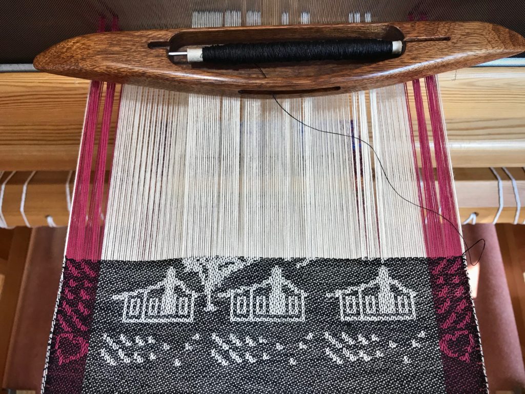
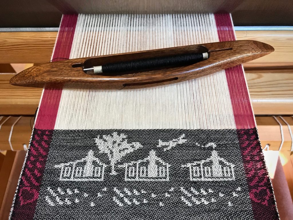
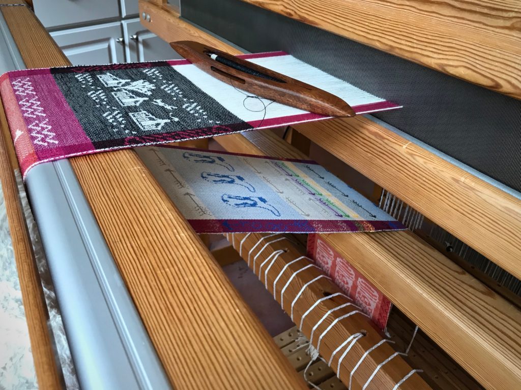
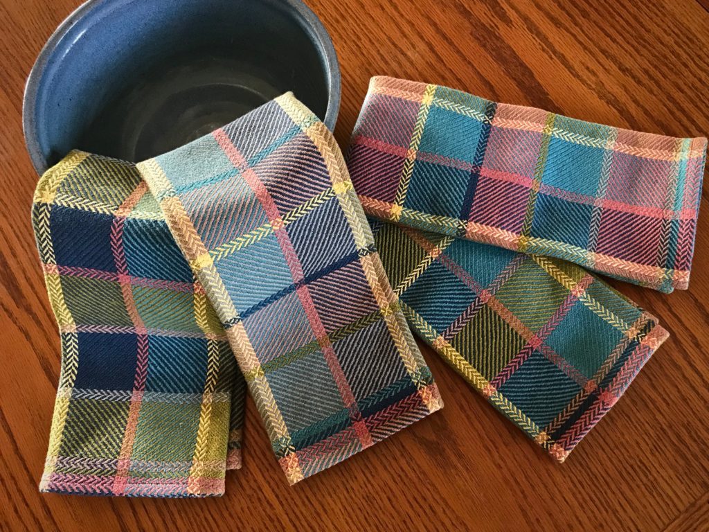
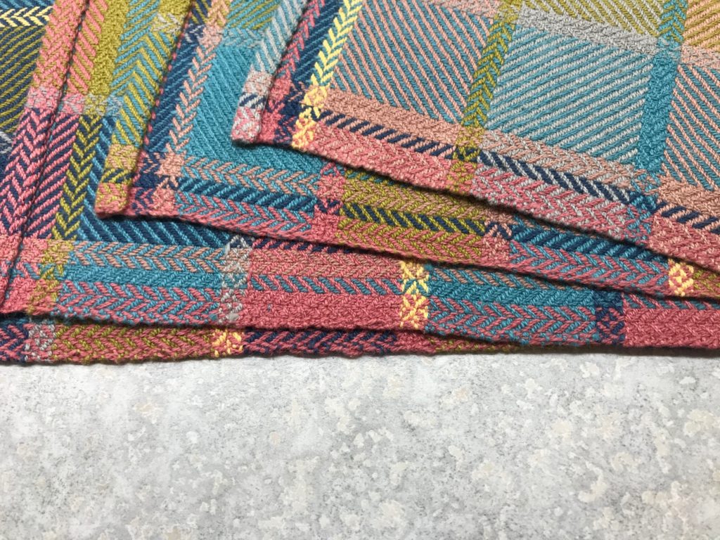
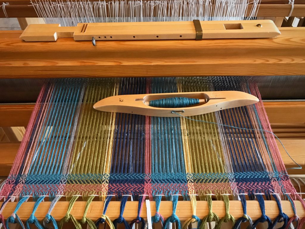
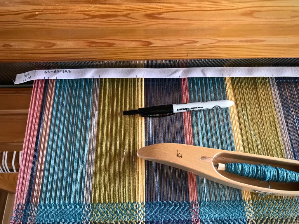
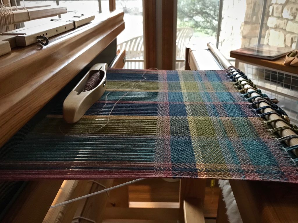
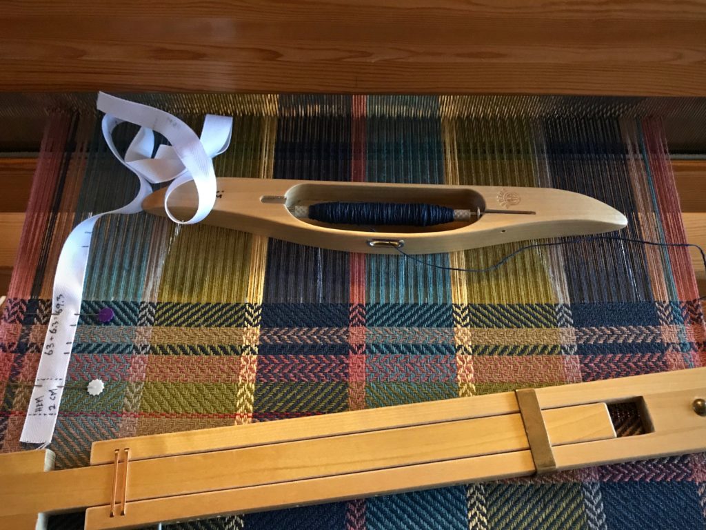
These towels make me think of my father. He was a brilliant architect. As an architect’s daughter, I learned to appreciate the interaction of structure, design, and color. This fabric has it all! These towels are also an expression of joy, a prominent aspect of my dad’s personality. If you could create a tangible article of jubilation, this would be it.
After weaving three towels, I eliminated the floating selvedges. Which one of the four towels do you think was woven without floating selvedges? Leave your answer in the comments. (1 – 4, with the towel on top as #1.)
Here’s a short slideshow video that shows the process from start to finish:
Jubilation bath towels are up next on the Glimåkra Standard!
May your jubilation rub off on your family and friends.
How do you come up with a design for standout hand towels? Sometimes it’s nice to start with someone else’s ideas. There is a gorgeous wool throw, designed by Anna Svenstedt, in Favorite Scandinavian Projects To Weave: 45 Stylish Designs for the Modern Home, by Tina Ignell. This Colorful Throw—Reverse Twill makes a perfect template for designing eye-catching hand towels.
Decisions:
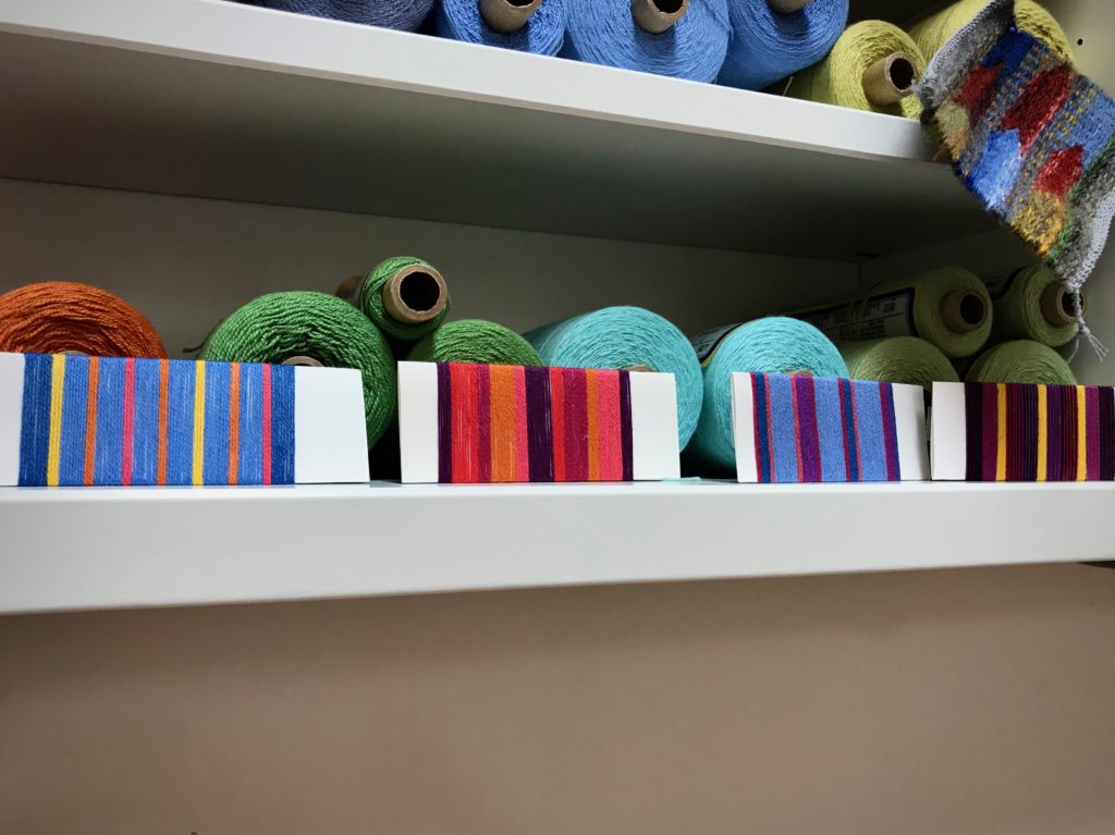
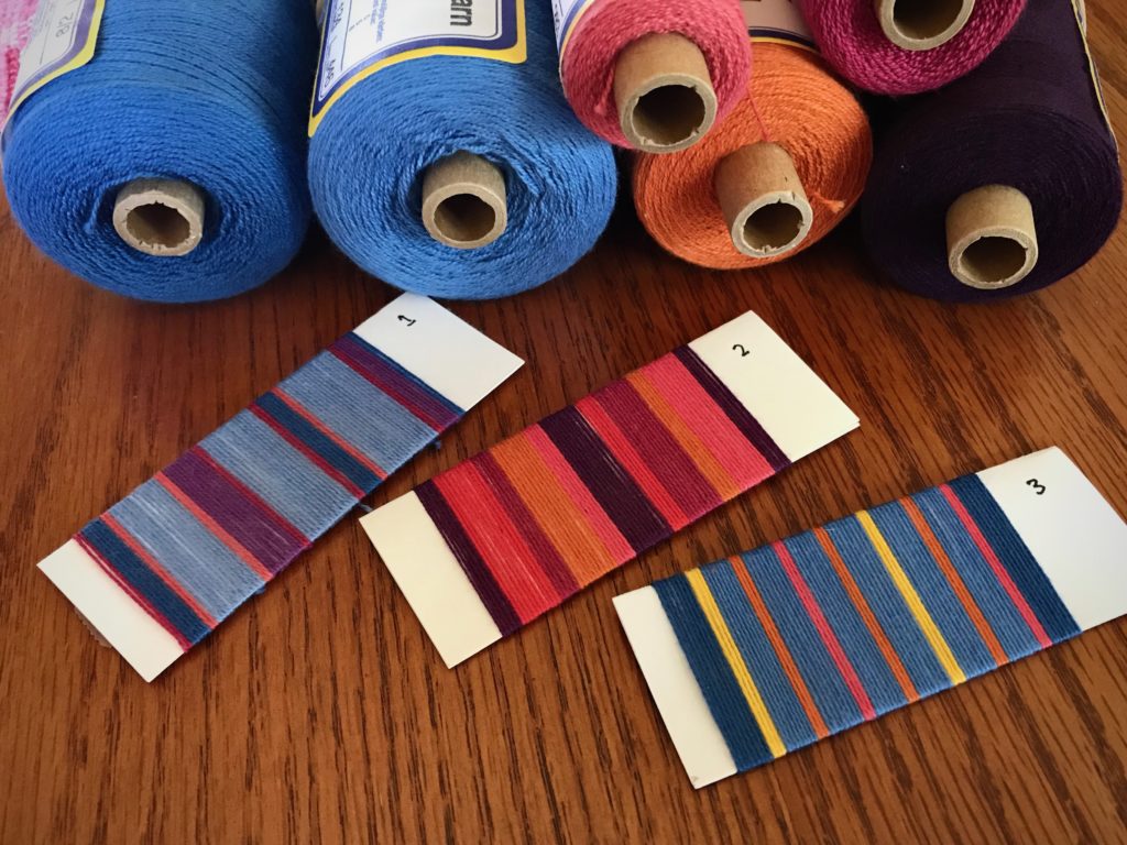
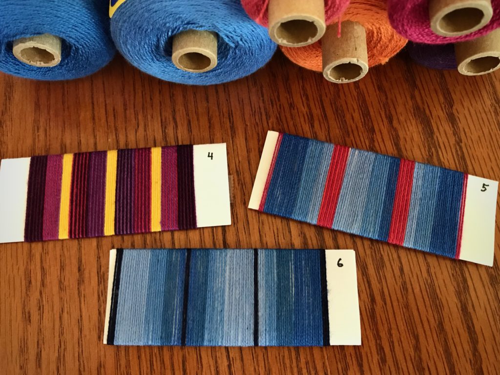
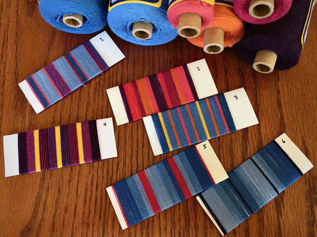
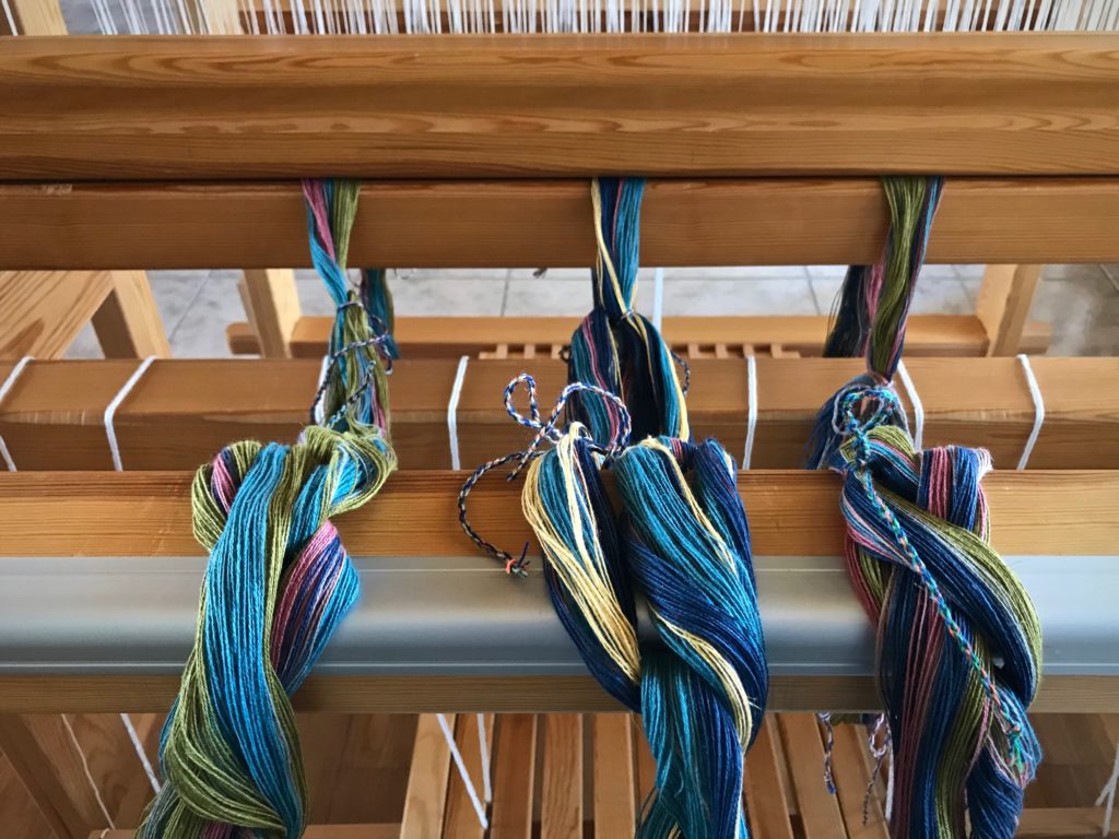
Colors – a set of seven colors, to be used in warp and weft
Fiber – 22/2 cottolin for warp and weft
Reed and sett – 50/10 metric reed, 10 ends per centimeter (~ 12-dent reed, 24 ends per inch)
Finished size of towel – 39.5 cm x 63 cm (15.5” x 24.5”)
Number of towels – 2 pairs of towels = 4 total
Spacing of warp stripes – add two more narrow stripes at each selvedge to balance the pattern
These decisions enable me to prepare a project plan, make calculations, and write a new weaving draft.
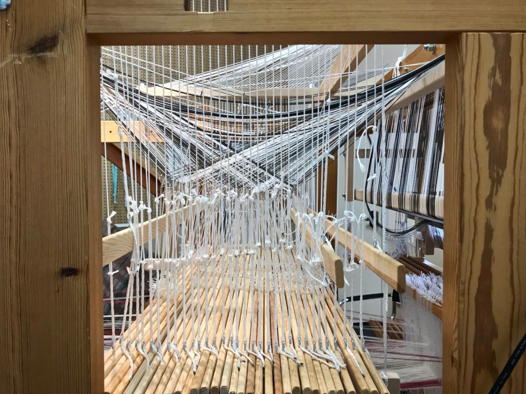
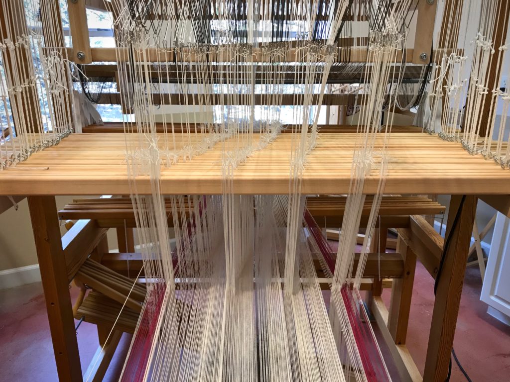
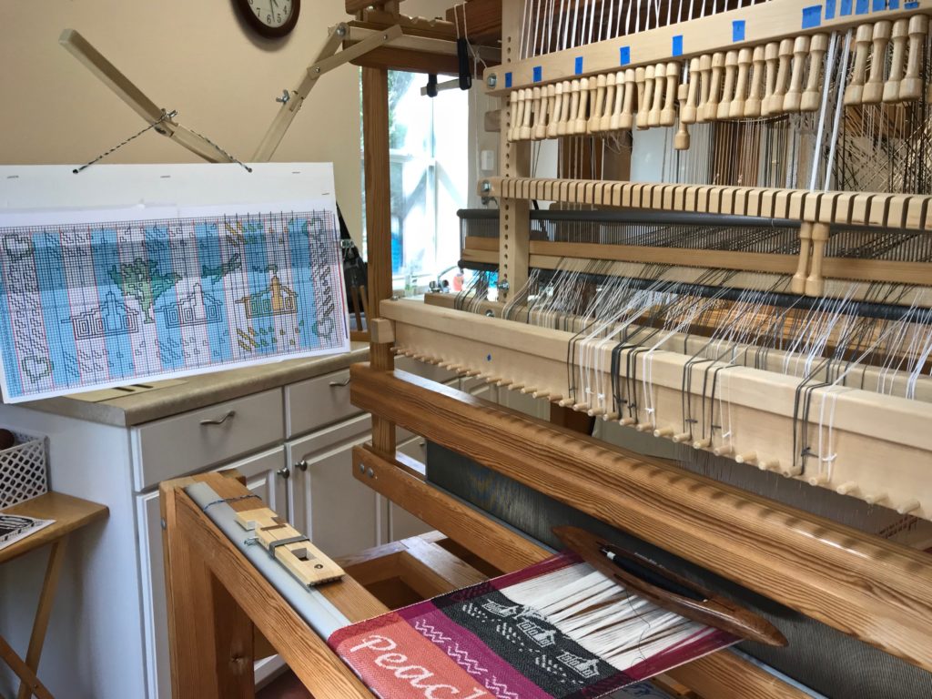
When the loom is dressed, the design process continues as I begin weaving a sample section. This is where I decide what weft colors to use, the spacing of weft stripes, and specific treadling patterns. I add these notes to my project sheet, which I keep at the loom as my weaving roadmap.
These hand towels are a preview. If they turn out as hoped, I may have to make some bath towels to match.
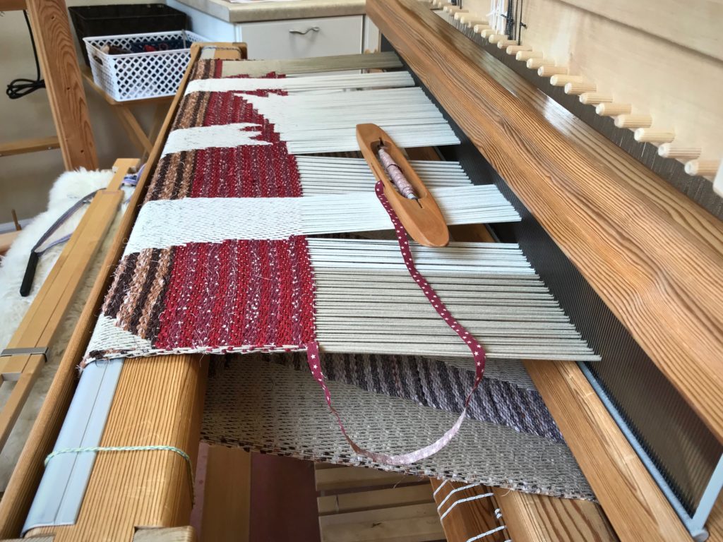
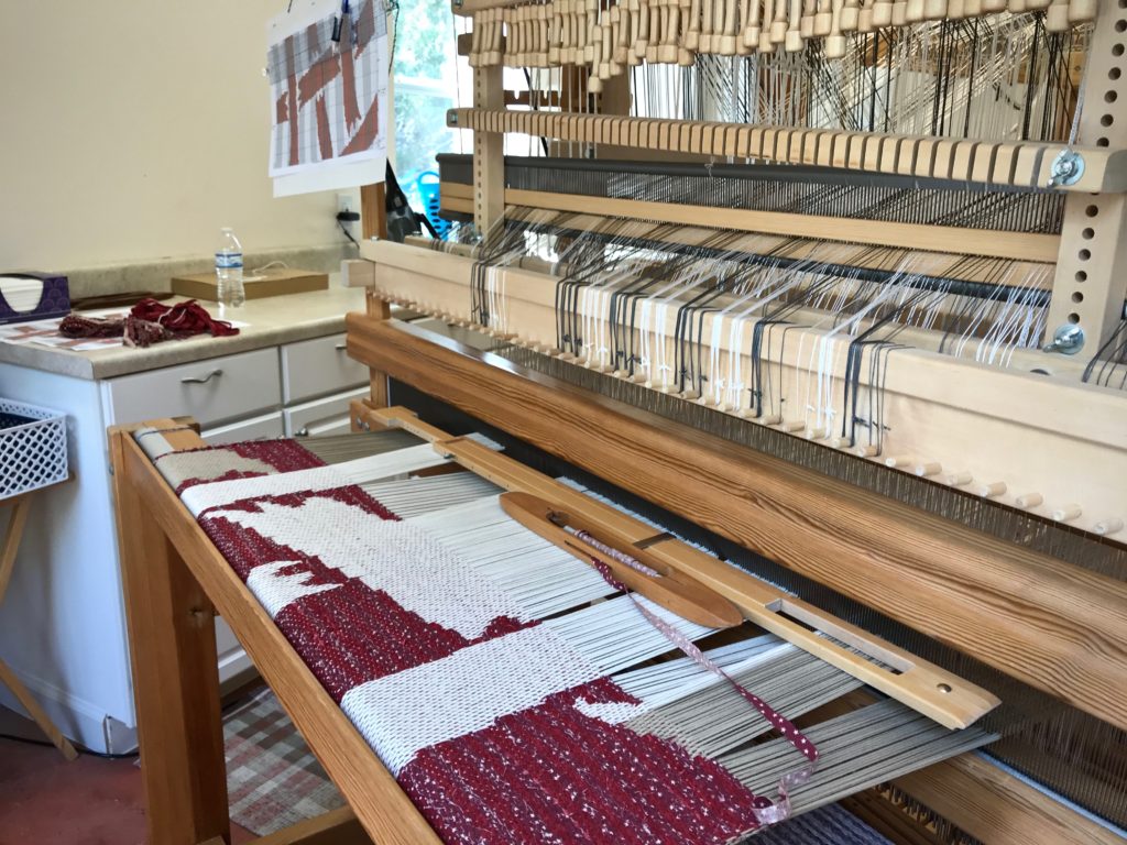
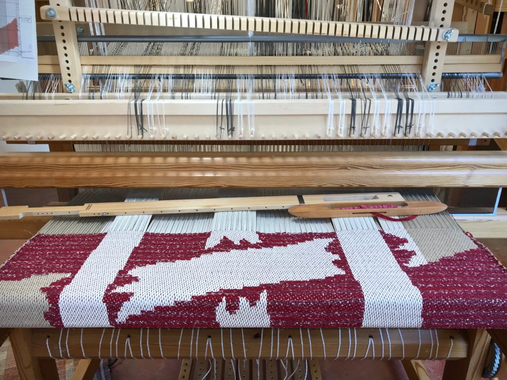
This fifth rag rug on the warp has the same classic rosepath design as the others. This rug, however, has rosepath as a whispered hint instead of the usual bold statement. Colorful beauty? Yes. Yet, it’s quiet. Restful.
The rosepath pattern is fully present, but soft-spoken. In the pattern areas, there is only slight contrast between the pattern weft and ground weave weft. The print fabric that is used for some of the pattern weft leaves spots of color, which also helps to blend the pattern into the background. The hint of a pattern makes you take a second look to see what is really there.
A restful person is like that, making us want to take a second look to see what’s behind that demeanor. Rest is a form of trust. Trusting God’s grace means believing that God will give us what we need. And that brings rest, the kind that is on the inside. Deep inside, where the pattern of grace is fully present, our being is transformed. And whatever is on the inside will show on the outside. Colorful beauty? Yes; and quiet, too. Restful.
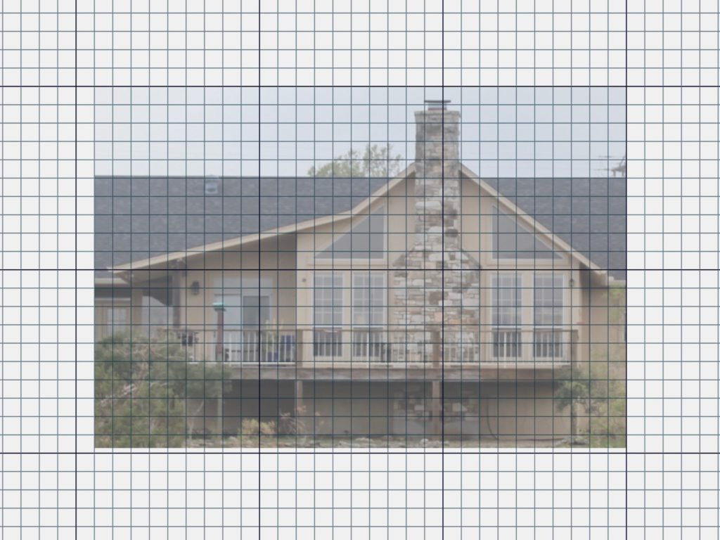
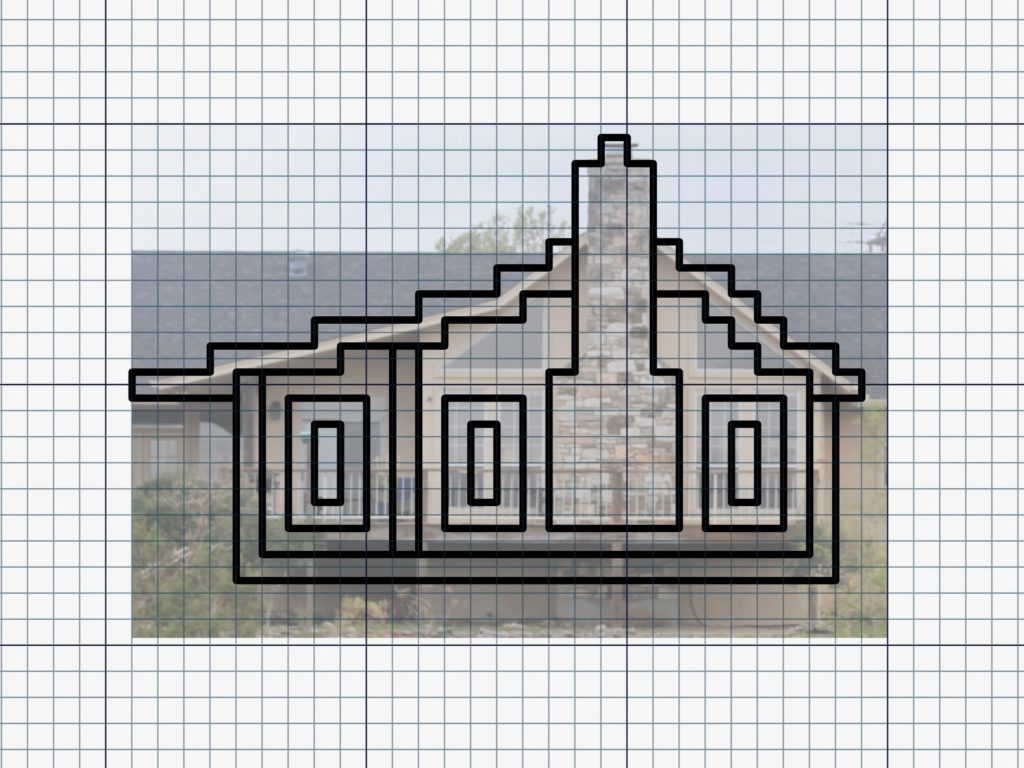
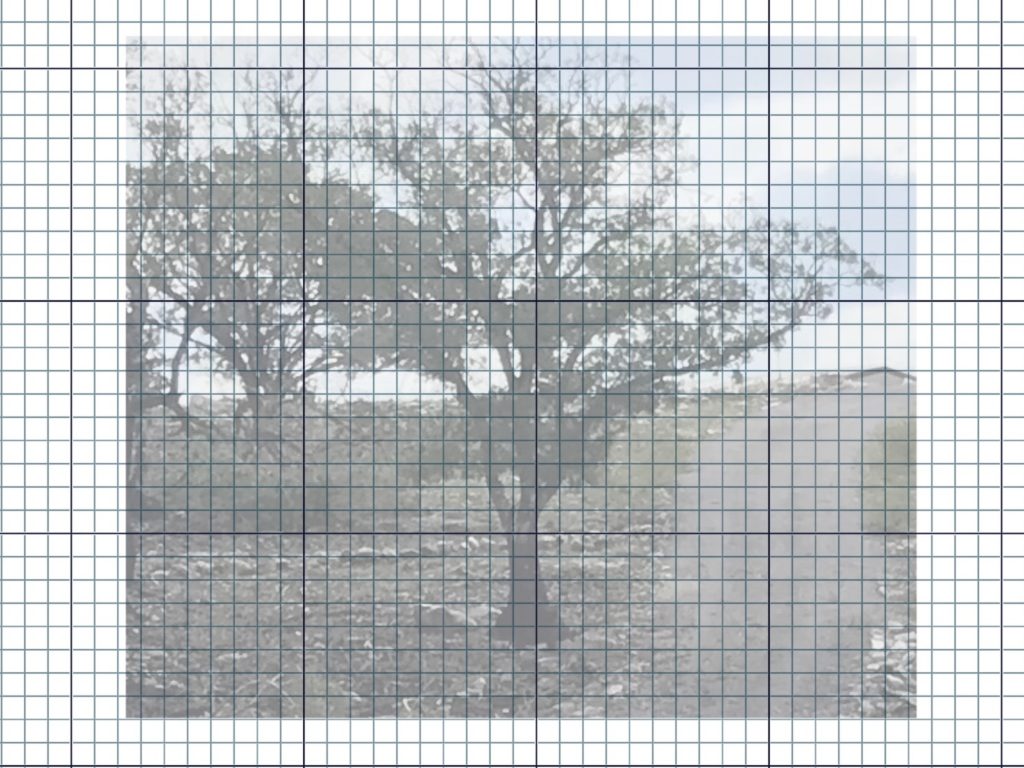
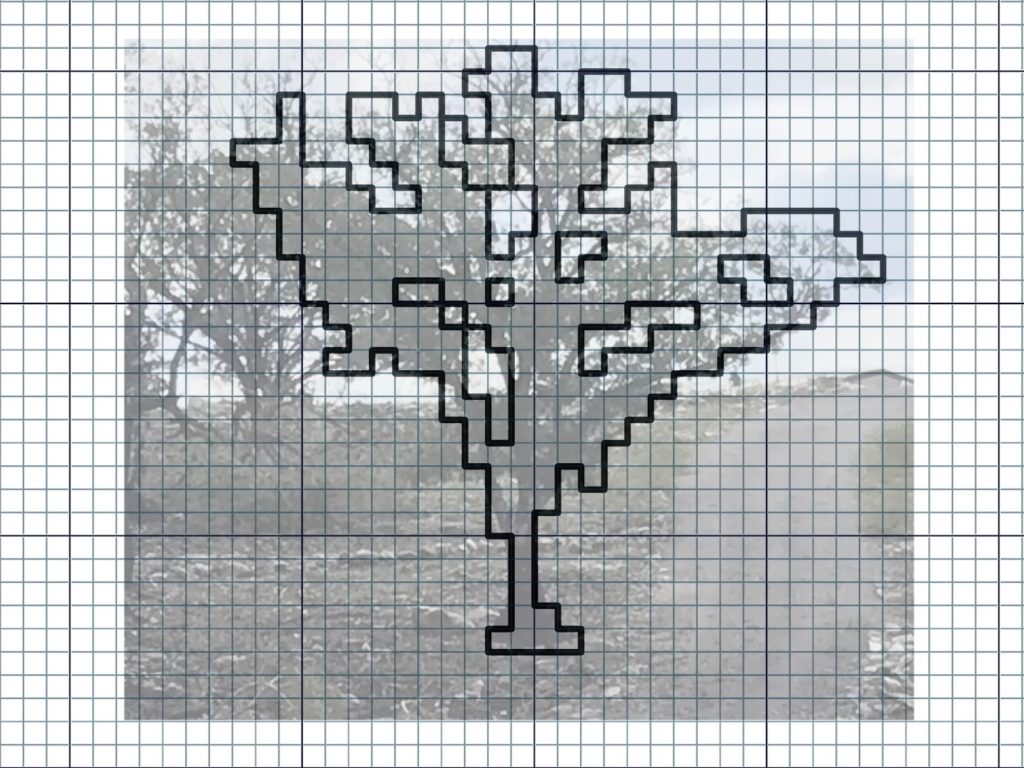
This seems unreal, like pulling an item right out of my imagination and touching it with my hands. It is exhilarating to watch a concept sketch develop into a tangible rag rug on the loom. Even though I enjoy designing at the loom, I relish the challenge of preparing a design in advance. In order to make a workable sketch I must study, think, and explore. It’s in this process that I realize the design options are limitless for rosepath rag rugs. This compels me to keep pressing in to learn and explore even more.
The concept sketch is a scaled-down map of the rosepath rag rug. Each square on the gridded paper represents 6 centimeters. The sketch shows me which fabrics to use where, and specifies the placement of each design element—borders, plain weave, rosepath diamonds, dashes and dots of specific colors, etc. I add notes to the page as I weave, like specific treadling sequences and measurements, so that I can mirror them on the second half of the rug.
Nothing can measure the greatness of the Lord. His greatness is truly limitless. Greatness is compelling. We step closer to search the unsearchable, and know the unknowable. God reveals himself, sketch after sketch, until we finally realize that we need all eternity to fully know him.
Why sample? It means using morewarp and weft. And it means waiting longer to start to the “real” project. What do I gain from it, anyway? Is it a waste of resources and time?
I can’t imagine putting on a warp that didn’t have room up front for sampling. There’s more than one reason to put on sufficient warp to weave a sample. It makes perfect sense, especially if there is anything new or unfamiliar about your planned project.
Five Reasons to Add Extra Warp for Sampling
1 Space to play. I want plenty of room to play, and to practice techniques that are new to me. 2 Room to try out designs. By weaving a portion of my designs, I am able to determine what works, and what adjustments need to be made. 3 Warp for testing weft colors. Only when woven can I see the full effect of each potential weft color. 4 Time to gain a consistent beat. When I start the main project, I want to have woven enough to be able to “feel” how firmly or softly I need to move the beater. 5 The best reason of all! It’s always good to have enough warp on the loom that you can invite friends and family to enjoy some weaving time. …Before your main project is in progress.